Storyboard・Director:
Toshiyuki Tsuru
Animation Director:
Hirofumi Suzuki
Genga:
Norio Matsumoto, Chiyuki Tanaka, Toshihisa Kaiya, Atsuko Inoue, Chikara Sakurai, Masaru Hyodo, Tetsuya Takeuchi, Kazunobu Hoshi, Miwa Sasaki, Takaaki Sekizaki, Nozomu Abe, Hideto Komori, Shigeki Kawai
3DCG Background:
Shinji Yaginuma, Hirofumi Suzuki, Toshiyuki Tsuru
Every NARUTO fan (myself included) initially remembers this episode for one moment and one moment only. This is the first of a three-episode fight in the middle of a tournament arc. There are no subtle webs of characterization here, no underlying machinations, nor somber meditations. NARUTO #48 is instead about an ‘explosion of youth’ – and explosions are easy to remember. Furthermore, if you watch these three episodes back-to-back, it’s understandable that some of the finer details might fail to penetrate the malaise commonly associated with binge-watching. Thus, it’s no surprise that Rock Lee sheepishly dropping the several ton-ankle weights dominates the discourse. As the perfect mix of unexpected and charming, there is genuinely something to this moment that makes it so memorable. Even Hiroyuki Yamashita speaks of it as one of his earliest memories of NARUTO, reading Masashi Kishimoto’s weekly manga during his formative years. Kishimoto, like most shounen mangaka, owes a lot to Akira Toriyama’s Dragon Ball, and Rock Lee’s weighted clothing is one of the more tastefully constructed nods to the genre’s pioneer. With that said, this moment is built on a foundation of artistic excellence both traditional and groundbreaking, and it’s only by continually revisiting it with a watchful eye that one can develop a proper appreciation for it.
At the core of that artistry is a single act of ingenuity: Toshiyuki Tsuru and Hirofumi Suzuki personally modeled the battle arena in 3D CGI, before hand-drawing the characters as they normally would, except now within the newly constructed setting. This 3D model became an integral backdrop for the action, with many dynamic camera rotations and perspectives that would be otherwise near-impossible under traditionally constructed background art.
On the topic of tradition, at the time this episode was conceived, the anime industry was in the midst of a drastic shift in its various pipelines. Advances in computers instigated a wave of digitalization that made its way to every department during the twilight years of the twentieth century. Coloring, compositing, background art, and even animation evolved on separate timelines, but eventually, each domain embraced the convenience that computers brought to certain tasks. One such convenience is the modeling and animation potential of CGI. Throughout its history, including to this day, CGI in anime is typically deployed in lieu of drawing complicated objects, whether that be robots, buildings, vehicles or any other number of cumbersome concepts. This is understandable and easily justified, but not particularly interesting from the lens of sakuga appreciation. For our purposes, the spotlight should instead be shown on those who identified strengths in the new technology before them, and sought to implement it in creative ways. To that end, the director duo of Shoji Kawamori and Kazuki Akane had their flashes of primitive, computer-generated brilliance on anime such as Kenji no Haru (1995), Escaflowne (1997), and Arjuna (2001), although little of it has aged particularly well. At the other end of the spectrum, high-end theatrical productions with forgiving circumstances such as Metropolis (2001) and Studio Ghibli’s Princess Mononoke (1997) flexed the full extent of their resources. This resulted in many scenes that are memorable in part to the computer-assistance, rather than in spite of.
There were also those at an individual artist level – dual threats who channeled their passion for creating into learning the ins-and-outs of computer software like Blender and Photoshop with intentions of adding an extra dynamic to their work. Today, this category of artist is well represented. However, around the turn of the millennium, the industry was comprised primarily of those who did not have the privilege of growing up surrounded by computers. Instead, they had to learn alongside its evolution. Mitsuo Iso is perhaps one of the most widely-known cases. Anime that age as fantastically as his Dennou Coil (2007) do not happen by accident, but rather as the result of continually learning and experimenting with digital tools over years. The scene he produced on Blood: The Last Vampire (2000) was a major turning point. For the first time, Iso personally handled the coloring and compositing of his own cuts, contrary to decades of tradition which demanded that task fall upon the coloring and compositing departments, respectively. We can also look towards the many [1][2][3] attractive Adobe After Effects filters that he designed for RahXephon (2002) which, with a few modifications, were seamlessly incorporated into the visual language of Dennou Coil.
Naturally, this is the category of artist that Toshiyuki Tsuru and Hirofumi Suzuki also fall under. Without their personal testimony, it’s impossible to state where their shared interest in CGI may have started, though their proximity to the aforementioned Shoji Kawamori and Studio Satelight may have been an influence, as well as Sunrise’s Kazuki Akane and Yoshiyuki Takei. In any event, most of Toshiyuki Tsuru’s work in this period features highly innovative digital experimentation. His influence on Neo Ranga (1997) actually managed to shift the production from a fully-cel anime into somewhat of a hybrid towards the end. His openings, the second of Great Teacher Onizuka (1999) in particular, are works of art that embody a once-in-a-generation creative spirit. With that said, the aspect that ultimately sets Toshiyuki Tsuru apart from his peers in this category of rare 2D-3D hybrid artists is that, until this point, a concentrated effort to integrate CGI into the structural backbone of a full length TV anime episode was practically unheard of.
Even more astounding is the fact that NARUTO #48 is not even his first time embarking on such an ambitious endeavor. Its place in history is instead second to the thirteenth episode of a little known anime called Kaze no Yojimbo, which aired two years prior and of course shares essentially the same staff. In a sense, it could be seen as the character-focused foil to NARUTO’s action focus, so understanding this previous work is crucial. Namely, it’s important to note that the episode unfolds entirely within a single indoor location, which enabled the CGI modeling approach that would later be transferred to NARUTO #48. As previously alluded to, CGI modeling and animation is relatively expensive and time consuming. The lack of a frequently changing setting bypasses both of these restrictions, since only one model needs to be built and simply recycled depending on the context of the cut.
The episode is phenomenally constructed, even beyond the avant-garde CGI experimentation. As a loose re-imagining of Akira Kurosawa’s timeless hit Yojimbo (1961), Toshiyuki Tsuru seized the opportunity to hone in on the famed director’s brand of heart-pumping tension and worked tirelessly to channel that into his presentation of the contents of the episode – contents which feel practically made for his sensibilities, mind you. A suave, noir atmosphere consumes a bar wherein a deranged game of Russian roulette, initiated by an ex-convict and an unwilling, off-duty police officer ensues. His presentation of the antagonist’s unhinged mental state is a fascinating sight to behold. The hyper-realistic drawings enforced throughout every cut leave no room for audience interpretation, and it’s this proximity with actual live actors that demands every second be taken seriously.
Another technique of Toshiyuki Tsuru’s repertoire is born here, and it can be found in the above clip. To appreciate it fully however, it requires an understanding of how camera movement in animation works. Specifically, the camera push-in and pull-out, which in anime industry terms corresponds to Track Up (TU) and Track Back (TB) respectively. When designing TU’s or TB’s however, a problem arises: perspective. Objects get bigger when you’re close, and smaller when you’re far. As you’d expect, the basic laws of the universe we’re all inextricably tied to determine how objects wax and wane in live-action cinema, and the animator’s rendering pipeline likewise obliges for 3D. 2D animation, on the other hand, is missing a dimension. A single drawing on its own is inflexible. If something is supposed to be getting closer or further, the sheet of paper can’t render that for the animator: they have to do it themselves. Thus, a TU/TB of the animated variety (in industry terms, “sakuga TU/TB”) involves correctly resizing – that is, redrawing – the subject for every single frame of the TU/TB while simultaneously running the already demanding mental calculations of timing and spacing required to make the drawings move in the first place.
Sakuga TU/TB are unpopular for the reason that it creates great instability in the subject’s form. The above example by Kai Ikarashi is superbly well done. Since few possess his expertise, most cuts designed in this way create a headache for the key animator and inbetween artist alike, with the end result more often than not landing in the realm of melt. Melt can refer to any number of different things with reference to animation, but here, it describes the unseemly inconsistencies between sequential drawings throughout any given movement. For most common episode directors found around the industry, a degree of melt is permissible – a simple, unavoidable consequence of processing cuts in this way. For those few aiming for perfection, though, a cleaner, less resource-intensive approach is preferable. Thus, the digital TU/TB was born: the process of scaling 2D images as objects. As a consequence, this technique creates less strain on the production, as you only need a single, static drawing, which is then scaled (not redrawn) on the computer frame-by-frame relative to the depth and position of the camera. Imagine the layers of animation as cardboard standees on a soundstage in front of a backdrop as a cameraman moves forward or back, and you can get the idea. In most cases, especially up to this point, that backdrop was also two dimensional. Enter Toshiyuki Tsuru, who took advantage of the intimate involvement he had in both the animation and compositing sides of the production to implement the digital TU/TB but, because of the 3D background, did so on an order of magnitude more complex than had ever been seen before. The video below contains a number of examples that hopefully clearly illustrate this concept.
At a more macroscopic level, the episode is the beneficiary of not being produced alongside another episode with the same staff (as #17 and #19 were), so the overall refinement of the drawings throughout #48 is much higher. Hirofumi Suzuki is the sole animation director this time around which, beyond being a good thing for the sake of consistency, benefits this episode considering he had a hand in the CGI as well. It goes almost without saying but, this episode would not have been possible without Suzuki looking after such a large portion of the animation on both the two and three dimensional fronts. Masashi Kishimoto had also yet to shift towards Tetsuya Nishio’s style of drawing, meaning the anime presents more refined art – a kind that is closer to what the manga would eventually feature. To that end, Toshiyuki Tsuru and Hirofumi Suzuki’s fierce, realistically drawn faces go a long way in making Gaara look as manic as possible. Meanwhile, under their hand, Might Guy adopts newfound youthful vigor. Guy in particular is even more animated than usual and acts as a regular intermission to the action, though his eccentricities can certainly be hit or miss depending on who you ask.
By virtue of being nearly completely original in design, and brought to life by the hand of the most skilled artist to work on the franchise, the lengthy action set-piece by Norio Matsumoto is the highlight of the episode.
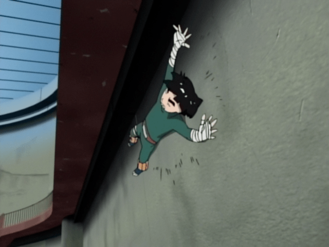
It begins with a neat illusion, as Rock Lee jogs in place while the three dimensional background falls out around him. Once Lee engages Gaara, the onus then shifts to the director to synchronize the 3D background rotation with Matsumoto’s analog-derived Gaara, rotating frame-by-frame accordingly. It’s important to emphasize where the onus lies because there is a frustrating lack of transparency on the production of this episode, which makes the exact implementation of Tsuru’s computer-generated methods unclear. On one end of the spectrum, it’s possible some level of CGI placeholder was constructed prior to the layout-phase and distributed to the animators as a reference for how the camera might move. On the other, it’s also possible that the episode was animated normally, and everything background related was instead done as full CGI animation after the animators had completed their parts. In closely inspecting the final product, we can theorize that the truth probably lies somewhere inbetween these two ends but surely much closer to the latter. The basis of this claim is predicated on some of the action cuts outside of Norio Matsumoto’s contribution, where the scale and perspective of the characters do not match the background. These examples clearly appear as if work was done to try and make the background ‘fit’ the animation instead of the other way around.
If that’s the case, how does Norio Matsumoto’s scene have completely flawless perspective and scale throughout? Well, for starters, Norio Matsumoto is no ordinary artist, but also because of that fact, Toshiyuki Tsuru and Hirofumi Suzuki likely bent-over-backwards to ensure every second of 3D background movement was perfectly synchronized to his work. Tetsuya Takeuchi’s scene – discussed in depth shortly – similarly shows a level beyond ordinary care. Thus, this is a case of an underrated principle that applies even beyond the scope of this episode: great animators demand great processing efforts and vice versa.
At this point of his career, Norio Matsumoto was much more eager to depart from rigid anatomical boundaries, pushing his drawings to their limit in the process. For this reason, frame stepping through his scene is a genuine treat in a way that few others can match. Rock Lee assumes all sorts of contorted and exaggerated poses. At a distance, he is typically adorned with slender, foreshortened limbs, while interspersed throughout are masterful close up cuts that use the camera as a sort of resetting point [1] for the action. There is obviously no stretch of his career that is anything less than brilliant, but if I had to choose one where most of my favorite work of his lies, it would be these twilight years of the 4:3 aspect ratio – NARUTO bias aside.
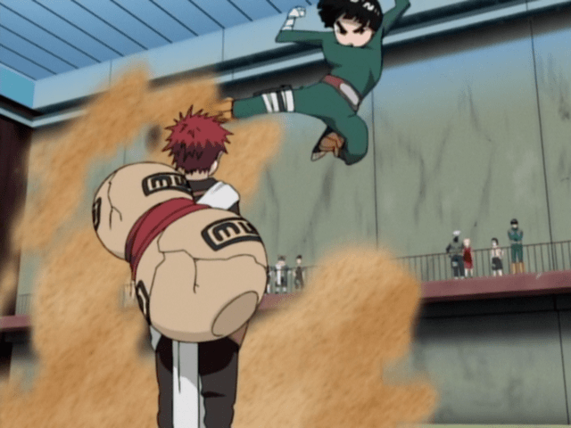
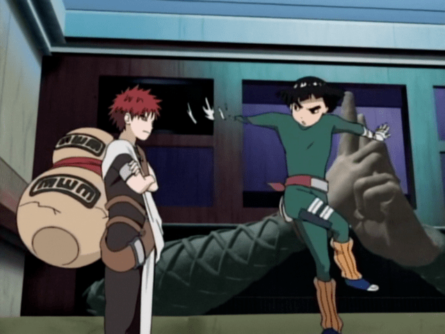
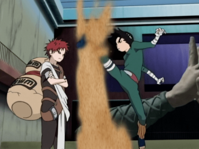
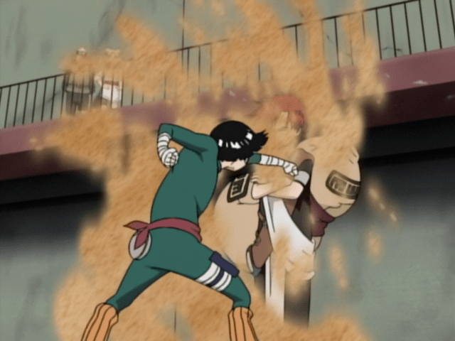
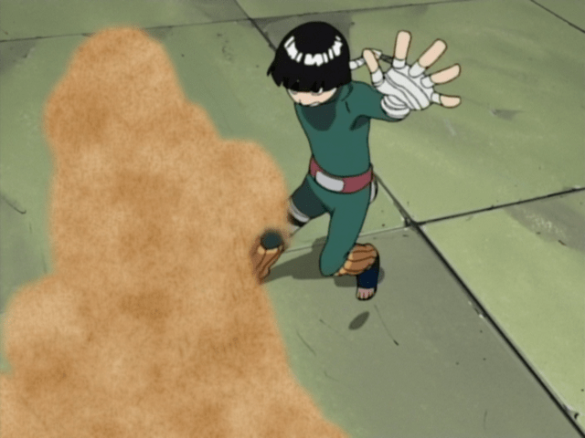
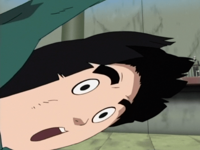
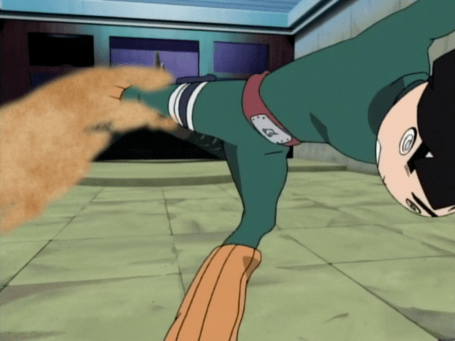
Another interesting wrinkle to the episodes’ action is Gaara’s sand. It’s uniformly textured and exceedingly two dimensional at that. This allows it to act as a frame of sorts – creating pockets of space which emphasize the three dimensional environment behind it. If the sand was represented with a more modern particle filter (a frame filled with holes is not particularly effective), or if the background was no longer 3D, such is the case on the very next episode, that optical phenomenon would be lost. Since Gaara’s sand is processed no differently here than it is throughout the entire rest of the show, this boon was likely not even intentionally designed, but rather just an interesting consequence of bringing 3D and 2D together in this way.
Norio Matsumoto’s action is invariably the highlight of the episode from the perspective of individual animator contribution, however, there is one other readily identifiable scene courtesy of Tetsuya Takeuchi.
In the six months since his last appearance on an episode of NARUTO, Tetsuya Takeuchi leveled up significantly. In fact, 2003 could be seen as the most pivotal year of his career, as between Read or Die TV and NARUTO, he would cement his gelatinous style and commit to the work ethic that made him one of the most prolific animators of all time. While their animation styles are not all that alike, the mere presence of supervisors possessing such monstrous skill as Toshiyuki Tsuru and Hirofumi Suzuki propelled the young Takeuchi to dedicate his entire person toward honing his craft. Koji Masunari, director of Read or Die, has remarked the same, stating that it became a competition of sorts between NARUTO’s rising talent and the famed duo [2005 edition of S Quarterly]. Of course, as supervisors, it would be Tsuru and Suzuki’s job to support Takeuchi’s work and that they certainly did. The 3D background again offers unparalleled dynamism as Rock Lee zips around the suddenly stupefied Gaara. Gaussian blur, both a product of its time and a staple of Tsuru’s direction, is used to great effect, taking Takeuchi’s drastically foreshortened drawings and directing the focus of the viewer’s eye throughout the motion. Lastly, one of Rock Lee’s final punches is augmented with the same fractal noise overlay as seen in the seventeenth episode, only this time it’s appropriately colored green instead of black and white.
Outside of Norio Matsumoto and Tetsuya Takeuchi’s scenes, the rest of the episode is quite faithful to its manga counterpart, with the exception of most of the shot compositions being more complex thanks to the 3D background. The final Primary Lotus again takes tremendous advantage of the background by having the characters spin in a fairly simple loop while the entire arena does all of the work selling the scene around them. The curtain closes a few pages short of the end of chapter 83, which leaves Gaara’s fate up to a cliffhanger. In hindsight, it’s a somewhat odd conclusion, and perhaps ending on more of a bombastic note, such as the Lotus itself, would have made this part more memorable, but it’s a minor difference in the grand scheme of things.
There is no shortage of deserving acclamatory language that can and has been leveled at this episode. However, for as revolutionary as their work was, it didn’t immediately initiate any large-scale, dramatic changes throughout the industry’s practices. Any hugely innovative work, especially one on a long running TV anime, will take time for the masses to digest, but it was also made possible only through highly specific converging of circumstances. This includes, but is not limited to: an episode contained within a single indoor location, the seemingly carte-blanche opportunity to experiment, the knowledge to use the technology, as well as the 2D-drawing prowess to go hand-in-hand. While there were a few others at the time who possessed the knowledge and ability, the importance of such an opportunity as the one Toshiyuki Tsuru received, not once, but twice, cannot be overstated. Thus, the narrative surrounding NARUTO #48 would not be complete without the circumstances that enabled it and these, in some ways, are as meaningful as the individual skill on display.
Where most productions aim for consistency across all its episodes, NARUTO’s unorthodox approach, initiated by producer Naoji Hounokidani and series director Hayato Date, was one which aimed to pool all their resources into the episodes which covered the supposed best content. This naturally comes at a cost, and it’s one which often left many of the non-high priority episodes with, at best, just barely enough to scrape by, and at worst, full-on collapse. Thus, NARUTO simultaneously has some of the highest highs to have ever aired on television, and also some of the lowest lows. Whether or not you agree or disagree with this feast or famine approach is besides the point, and there is certainly an argument to be had on both sides. However, the fact of the matter is that it enabled inspired directors like Atsushi Wakabayashi and Toshiyuki Tsuru the freedom to not just adapt the manga, but create genuine, long-lasting art in the process.
Eventually, CGI-constructed environments would find their way into common industry practice. In an effort to incorporate complex indoor environments without relying on the skilled draftsmanship of an established animator (in short supply these days), many animation studios have pursued this avenue wherein the CGI department creates a rudimentary model which acts as a base level layout, or guide, for the key animator or background artist to draw on top of [1][2][3]. This shifts who has the most impact on the outcome of particular cuts away from the animators, and instead places it on the CGI team under episode director guidance. It’s a shortcut, and one that will ultimately act as a crutch for beginners who might go years without having to draft complicated perspective by hand. Conversely, this way of working smarter, not harder has saved a lot of time for animation staff and has also avoided a lot of broken compositions in the final product. Therefore, this relatively new pipeline is not without its advantages and disadvantages. However, weighing them is beyond the scope of this piece.
If we are to find highly creative uses of CGI in the midst of hand-drawn work then rather than looking at the studio level, we should be looking at individual artists instead. Those like Ren Onodera or Hiromitsu Seki who first model background animation, or even their characters in the case of the former, achieve a feeling in their animation that would be otherwise impossible by hand alone. Shingo Yamashita has even gone so far as to filter and process Youtube videos in lieu of hand-drawing explosions. Tatsuya Yoshihara time and time again used his freedom in Black Clover’s production to integrate noise and CGI environments in his action scenes, though often his CGI would appear in the final product, not drawn over, much like is seen in NARUTO #48, but on a smaller scale. As far as recent, episode-spanning endeavors, there is Shota Goshozono, who at this point as a director, likely comes closest to Toshiyuki Tsuru’s original vision. The eighth and twenty-second episode of Ousama Ranking, both of which he storyboarded and directed, are each an absolute clinic of Blender software proficiency, with most of the cuts donning tricky perspectives much in the same way Tsuru once did.
The fifteen year gap between then and now stands as a testament to how far ahead of their time the duo of Toshiyuki Tsuru and Hirofumi Suzuki were. Their creative passion spurred the growth of countless artists, both those who worked directly with them, but even the generation of children who watched wide-eyed, glued to their television. Their work will forever exist as a relic of an era gone by, and an important reminder of the creative possibility that anime, as a platform, is capable of providing.
If you enjoyed this post, please consider supporting on ko-fi: here
Despite Tsuru’s influence on Yamashita, the latter does not seem to have the same appreciation as the master for CGI and digital techniques.