This article was originally a part of my bachelor thesis titled “Contemporary art form of animation as a tool for influencing viewer’s emotions; case studies from Japanese animated series.”
Summer vacation. Apathetic Nagara, a third year middle schooler, and his classmates are sent to another dimension where only their school is present. “This world,” as they call it, has its own set of rules, totally different from the one they know; that includes the supernatural powers that they, except Nagara, have gained. The quest to return home has begun.
Anime, just like pretty much any other creative medium nowadays, is heavily commercialised, hence a lot of the decision making is done by the producers and not by the creative staff themselves. Sometimes there are exceptions to that state of things, when the producers give the artists free reign and total control over the project. Sonny Boy is such an example: a show envisioned, directed and written by Shingo Natsume, who explicitly stated before the broadcast that this is the first and probably last time when he’ll be given such freedom to do whatever he wants. He even called his work on the series downright selfish and egocentric, because he wanted to include in it as many elements important for him as possible. This freedom became a key factor shaping the entire project, including its visual identity.
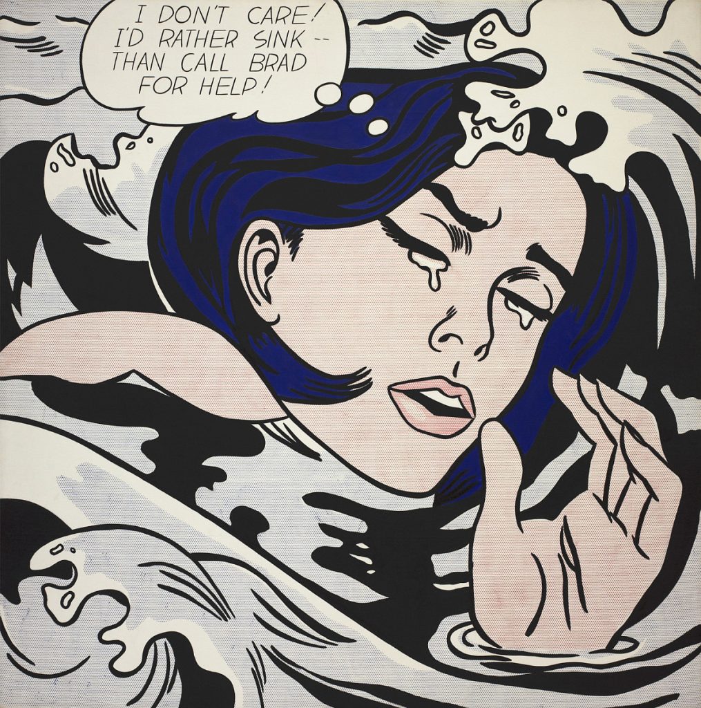
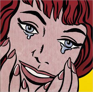
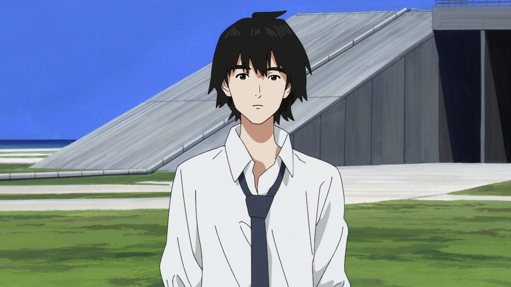
Sonny Boy is an abstract, metaphorical story about growing up and finding one’s way in life – a nostalgic journey through ideas about adolescence – but also a disturbing story about society and its structures. To help give this sense of nostalgia life, Natsume invited Hisashi Eguchi: an artist whose illustrations, even the modern ones, vividly evoke the pop art aesthetic of works from the second half of 20th century like Roy Lichtenstein. His initial designs were then adapted to animation by a good friend of Natsume: Norifumi Kugai, who wanted them to look like Eguchi’s work from Eiji (1984-1985): a manga about boxing. More specifically, his main goal was to make the characters look realistic and un-anime. Both Natsume and Kugai clearly aimed for something squarely outside typical TV anime – something that would make viewers feel not just melancholic but refreshed by experiencing a piece of work that hadn’t been created just to satisfy a producer’s preconceptions about what anime fans want. Natsume put it like this when he commented of Eguchi that he “creates a sense of nostalgia while remaining very fresh.” Moreover, by combining realistic character designs with a grotesque world, they managed to achieve a certain sense of dissonance.
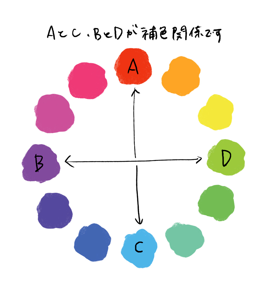
This dissonance is something that’s also mentioned by the art director: Mari Fujino. Natsume wanted the backgrounds of the show to be analog, so they could maximise the intensity of the colors. The script that he provided made Fujino seek out a way to somehow transfer the feelings she had while reading it directly to the screen. Citing advice she had found during her research, she decided to use complementary colours. When an image’s palette is dominated by complementary colours, it often makes the viewer feel uneasy; she and her team approached the task with this principle in mind.
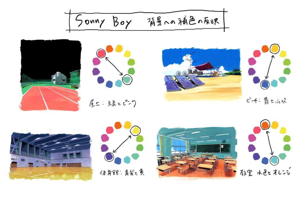
Natsume himself mentions that the uniformity of the colours is a way to make the audience focus on the story more. For backgrounds, he likes to use colors to communicate the thoughts and emotions of his characters, mainly through using color palettes dominated by a single color. He also leaned on the animation team led by Yuuichirou Fukushi, who drew them with excellent care. This is heavily related to the fact that Natsume didn’t want the characters to express their feelings through speech. He especially wanted to excise all monologue, but also deemphasized dialog. He decided to endow the image itself with language, allowing the characters to express themselves through their body language and design. Each one of them is dressed in the same school uniform, and yet we as viewers are able to tell what personality traits they possess by simply looking at the way they wear them, the most obvious opposites being Hoshi and Asakaze.
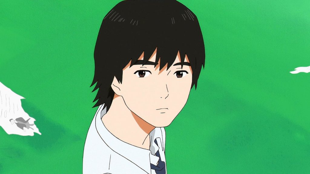
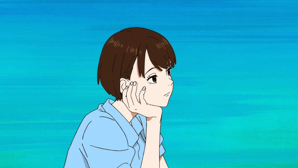
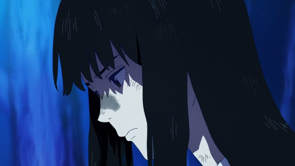
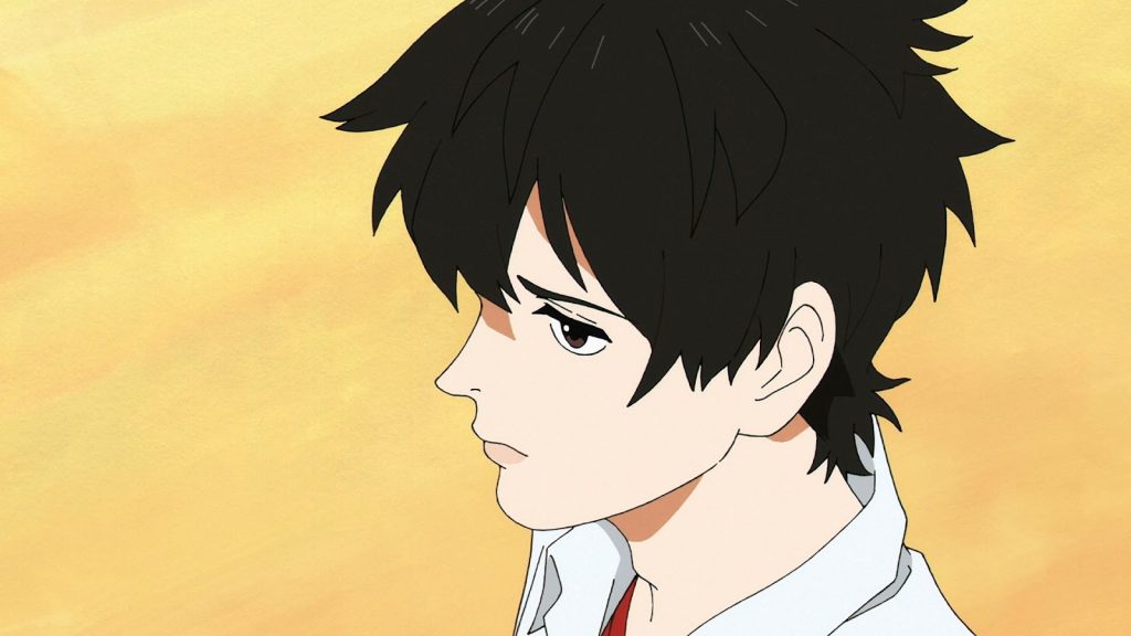
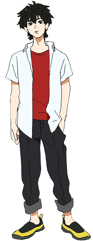
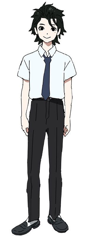
Fujino also says that in comparison to other directors, Natsume gave her a lot of freedom. The same can be said for the rest of the animation team. Natsume didn’t want the show to have a chief animation director (the exception being Keita Nagasaka who was entrusted with this role for the outsourced episodes), as he wanted all the specific animation directors to be able to show their own flavour. Kugai himself confirms that there wasn’t much of an effort made to standardise the animation style for the show.
As a result, the impression every episode gives is different. Reiko Nagasawa’s (animation director for episodes 2 and 6) rendition of the characters is remarkably subtle. Nobuhide Kariya’s (animation director for episode 3) way of drawing them is a lot more sharp: he focuses primarily on their clothing and the naturalness of all the folds in the materials, thus giving the whole thing even greater realism. Even Kugai, who supervises the animation in episode 11, doesn’t really stick to his own design sheets but proves at the same time that he understands them perfectly. The greatest example of artistic freedom given to the whole staff is episode 8, storyboarded and directed by Keiichiro Saito, who also served as the sole animation director. The episode consists mainly of flashbacks which allowed him to create his own vision of the whole setting. Saito not only designed the new characters himself, but also completely changed the colour palette, abandoning extremely vivid colors for more subdued ones, reminiscent of sepia-toned photographs. Creating just an episode for an already highly auteurial series, he managed to make something as auteurial as the whole project.
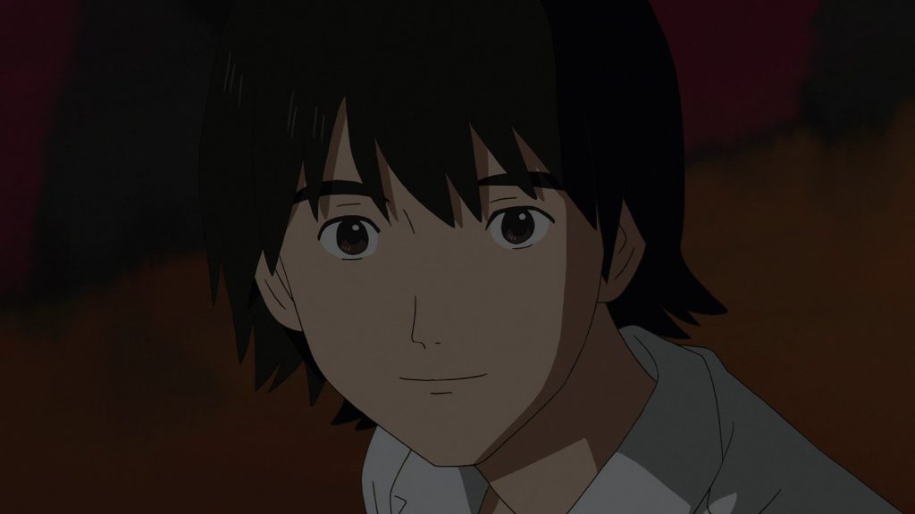
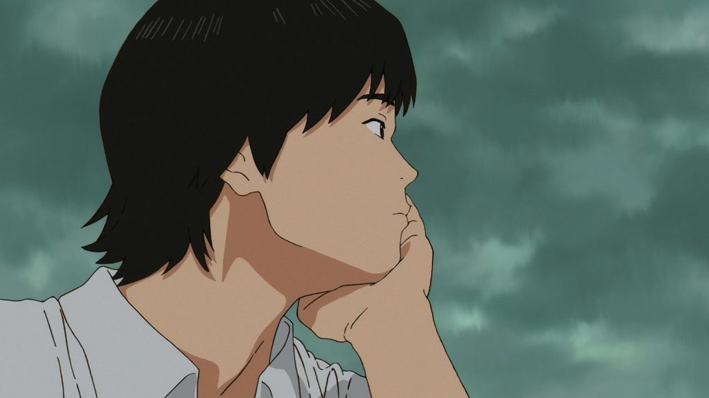
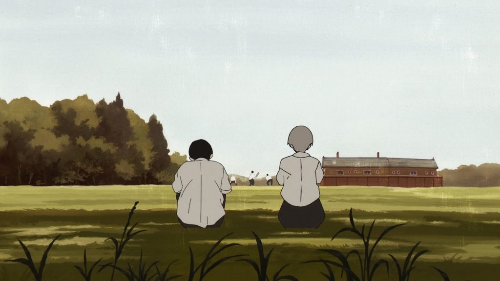
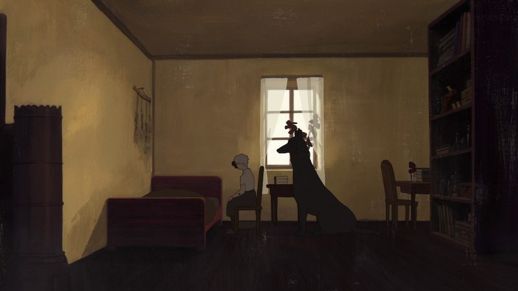
Natsume, having been given the opportunity to create his dream project, decided to share this freedom with others. This turned out to be a perfect tool not only for building reception and influencing viewers, but also for the expression of the artists themselves, who, like him, took advantage of the opportunity given to them.
Sonny boy is one of my favorite series, so seeing someone write about it is always a pleasure to read 😀