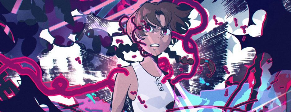
My Hero Academia #68
Key Animation: Yutaka Nakamura
Don’t blink or else you’ll miss it! Yutaka Nakamura’s latest contributions to the MHA franchise might be stylistically familiar to fans, but few were expecting the legend himself to lead off the episode without even an opening segment to allow us time to reach our seats.
Since there are only eight of them, lets go cut by cut breaking the whole scene down.
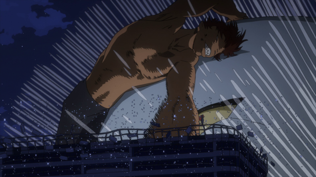
Cut 1:
The curtain rises and we’re immediately met with a challenging perspective, both for the artist to draw and the viewer to digest. Methodical background animation flows into the camera while a shirtless figure makes a mad dash over the freeway, Nakamura’s familiar timing and shading in tow. The ramp growing from the ground before passing over the top of our view feels like something easier achieved with CGI assistance but Nakamura being fairly traditional, as well as having transcended the limits of human form long ago likely managed to do without. Of course it wouldn’t be modern “yutapon” without his ostentatious impact frames placed anywhere he can reasonably fit them and the first cut features plenty of that.
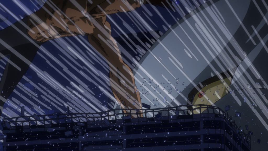
Cut 2:
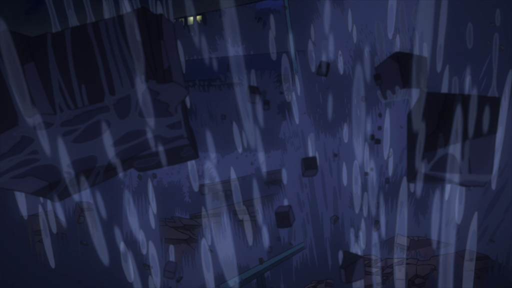
Much like the previous, the second cut also presents a difficult perspective. Now flying through the sky, the supposedly titanic figure suddenly looks a little less gigantic contending with the urban landscape. Buildings fly past at blistering speeds almost too quick to take in. Surely the similar color palate for structure and sky do no favors with regards to the readability of the cut either. The key here would be to use the foreground objects as reference points, contrasting against the incoming human-meteor, so we as the viewer can properly appreciate the magnitude of that leap. However, I don’t feel it accomplishes a proper sense of scale to the degree with which we’ve seen Nakamura attain several times before, mainly for the two aforementioned reasons (the latter of which is out of his control for what it’s worth). Regardless, at the very least it serves as the connective tissue in the middle of this scene, and he more than makes up for such a minor deficiency soon after:
Cut 3, 4, 5, 6:
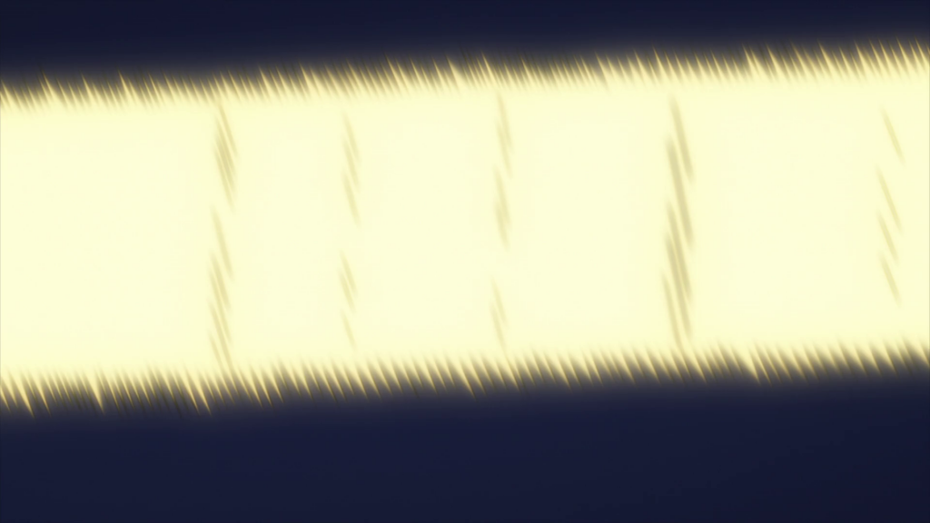
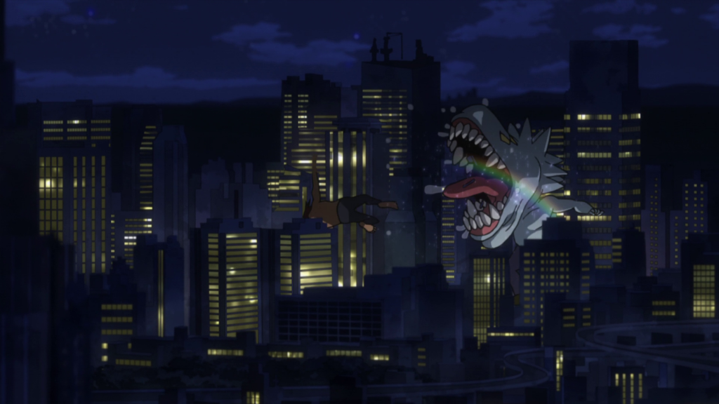
The next few cuts consist of the clash between the two characters and are only a handful of frames each so we’ll tackle them all at the same time. Nakamura’s densely layered effects are as obvious and familiar as ever, they might be a bit hard to see but it’s the usual cuboidal debris shapes which we all know and love to joke about. Personally though, the transition he constructed between cuts 4 and 5 are the more worthwhile element of the scene to talk about here. The line of action carries skyward through the two cuts, from the debris eruption at the ground level to a smeary close up of a near-by building, which then pans out and upwards in time for the clash. It’s quick and inconspicuous enough that without close inspection (or many repeated viewings) his technical efforts are missed on everything but the subconscious level of the brain, which can only regard something impactful happening, but fail to immediately register why it works so well. You might call that the goal of most animation even: creating scenarios to trick the fallible human eye into following the pace of the scene in subtle yet effective directions.
I really like that Nakamura reinforced this transition by having the mass of water streaks respond to the force of the landing in the same direction the action is flowing. The ensuing condensation-formed rainbow is a pretty neat minor detail as well, and of course as you would expect, he went there again!
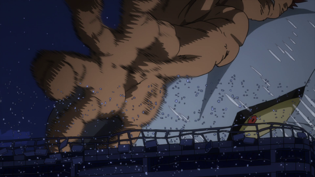
Cut 7:
Now at a distance, we join the police officer in watching as two jittery drunk idiots throw fists in the middle of a city. Nakamura’s layout is strong. Specifically, framing the fight in the upper-center, while the bridge and some trees are placed at heights to break the screen in half to contain the incoming police cars at the bottom. This separation of the two contrasting elements present in the cut is especially important when his approach to animating, ie. his timing and poses, are completely different between them. In the background we have tons of unpredictability, with key frames arriving at varied intervals and sporadic positions, giving that aforementioned ‘drunk’ feeling to the combatants. Meanwhile, the foreground is much more tempered. The movement of the police officer and incoming squad cars follow logical patterns with little left up to the imagination of the viewer. It’s this kind of nuanced approach found so commonly in his scenes which plays a large part in making him one of the best animators of all time in my opinion.
Cut 8:
The final cut of Nakamura’s contribution on this episode is extremely short but thanks to some deliciously varied line-weight, around the mouth especially, it warrants mentioning. His understanding of Yoshihiko Umakoshi’s design philosophy has been ever present in his works on this franchise, and in all honestly I think regardless of the designs he’s presented with, Nakamura possesses the artistic ability to make them look good.
While this first appearance on season 4 was short lived (we have the currently in production movie to thank for that), it’s not lacking in inspired effort, nor is it likely to be his last. Expect to see him later on in some capacity, hopefully for something a bit more substantial too!