Welcome to the second seasonal Artist_Unknown OP/ED Festival!
Spring has passed, but sakuga remains. Last season was ripe with things to discuss – far more than you’ll find in even this long post. It was going to be even longer, but unfortunately I was the only one to complete my sections. You’ll have to catch up with Geth, Dandy, and the rest next time. For now, you only have me. It’ll be fun, I promise!
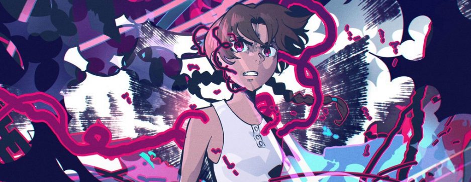
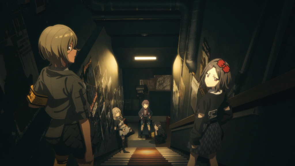
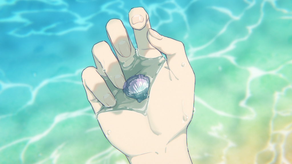
Which way is the apocalypse train headed?
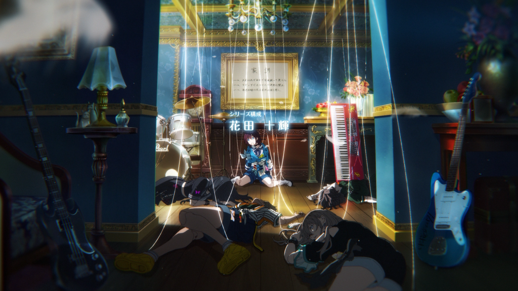
▷「GA-TAN GO-TON」
▷ by Nate A.M.
Let’s talk about these guys:
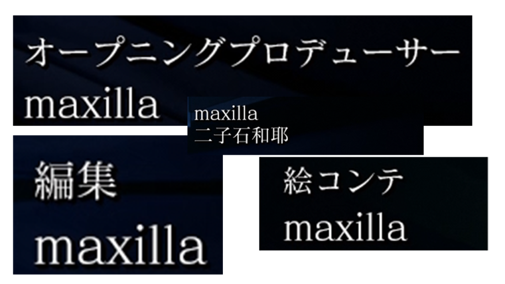
A subsidiary of Helixes.
Their primary service is marketing and branding: their portfolio is full of commercials, music videos, and motion graphics, and their products span the gamut from visual media to brand strategy and PR. You may ask yourself, “what on earth does this company have to do with anime?” I certainly asked myself that too.
The answer is a person: Yuki “Uki” Kamiya. He joined the company with some friends around 2019. The modern sakuga fan will best know his OPs for the second season of Jujutsu Kaisen, and his EDs (3 and 8) for Chainsaw Man; an artist of rare versatility and a sharp sense for design. It seems he allowed Maxilla to start taking on production-oriented roles beyond just 2DCG design. I’m sure this wasn’t actually a Maxilla strategic goal, but they haven’t given up yet and Helixes hasn’t stopped them.
Their persistence is notable, because Uki recently returned to freelancing. It’s his buddy, Kazuya Futagoishi, who chose to remain at Maxilla, and it’s he who directed this OP. Futagoishi helped Uki out with photography on the Kuma Kuma Kuma Bear OP in 2019 just before he graduated Kyuushuu University, but most of his work since then has been various MVs and PVs. Take this one for Sony’s wildly misguided vtuber project VERSEⁿ, which Sony dumped on Helixes to manage when – with no disrespect to the streamers – approximately zero people cared. Titled Akogare no Daimeikyuu, it’s a monologue from a series of monologues voiced by Tomori Kusunoki, from the idle thoughts of some girl with depression and half a dream.
mood tbh
It’s austere in both means and ends – typical of monologues. Film students may know Derek Jarman’s Blue, whose visual component is a field of Klein Blue for all 79 vivid minutes. That’s all Jarman needed. It makes Futagoishi’s Akogare no Daimeikyuu seem almost crude and excessive in comparison – which is no insult to Futagoishi. I picked out this video because it’s representative of his work: videos which make use of a few assets to get across a mood to accompany a song or, in this case, a monologue. I feel it sets the stage for his work on the Shuumatsu Train OP, which is maximalist and the exact opposite of almost everything I just said.
In EP10, the gyaru character Reimi comments that she’s grown rather used to the contorted world of 7G – that it’s chill in its own way. This is a strange thing for her to say which isn’t really supported by the show, but it is supported by the OP. Consider the way the OP starts:
When Youka presses the 7G button and Futagoishi speedruns the Powers of Ten TB with axial cuts matching the music, it’s accompanied in the music by a little square wave flourish. Futagoishi is associating the square wave line with the confusions of 7G with the power of montage. I can’t be sure composer Umuya Aneta had this in mind, but it’s a great interplay between music and visuals. As the camera tits upside down, does an aileron roll, and tracks through the Apogee, there’s another ascending square wave progression which is dissonant with the ~ga-tan go-ton~ but eventually resolves on the same two notes as the vocals: F and D#. This would technically mean they resolve on a consonance, but the square wave reaches and holds on the D# while Nakashima is still singing F, so the impression you get is from the dissonance of the one-and-a-half-step interval between D# and F, not the consonance of the [D#3, D#4] unison. Now, I dunno anything about music, but I do know something about vibes, and “it’s fucked up, but it’s still kinda chill somehow” is exactly the vibe Reimi was talking about.
The images of the OP mostly mirror the lyrics, which is unusual but not rare these days. When Nakashima is singing about how they’re on a journey to find (you), we get Shizuru shifting gears and throttling up while looking determinedly forward from the cab. During the light “~wa-ku-wa-ku-su-ru~ / hibike! whistle” part, we’re presented with a few vignettes of everyday life and also the absolutely kino cut everyone’s already seen where the Apogee pals are singing along with the ~ga-tan go-ton~. While Nakashima’s singing about how they’ll continue on even if the world itself is derailed, Futagoishi foreshadows a bunch of weird imagery from the show. He says he was given lots of notes from Tsutomu Mizushima, and tried to prefigure as much of the craziness from each and every episode as he could. In the show, the girls receive a childish sketch of a transit map that at first they discount as useless, but has accurately described every stop they’ve visited so far. The OP is a little bit like that map.
There is a playfulness here which extends to the montage – and this is where Futagoishi’s experience making music videos for Sony’s forsaken vtuber unit becomes important. The one secret AMV editors don’t want you to know is that cutting to the beat of the music is actually quite easy. It becomes more interesting in cases like this:
First, these aren’t cuts but rather wipes using the artifice of a passing train. Second, note how the last train-wipe is delayed by a beat at the end of the bar as the vocal line drops out, and then lasts two beats, spanning over the next bar in imitation of how Nakashima’s “hora, koko gaaaaa” spans over the two bars. I’m not sure exactly how to describe this musically, but it’s good. Just like how the song itself plays with rhythm, so too does the montage, and in this case, I think we can call the train part “animation” even if it’s done with 2DCG in AfterEffects and not sakuga. After all, the timing is very important here.
There’s an even more subtle example of this immediately afterwards as the Apogee passes through the tunnel:
Note how the first set of lights simply illuminate a swathe of the train as it passes through to the train-like DA-da beat, but because you can see the light source more clearly for the second set, they seem to twinkle as they get occluded for the DADA-da beat. It’s little touches like these that make animation such a great tool not only for music videos, but for the precise use of music in general – and it’s a shame the anime production pipeline mostly doesn’t allow for that kind of precision.
There’s a well-known story among Japanese otaku that one of the reasons producer Yoshinobu Nishizaki took notice of future anime luminary Noboru Ishiguro as a young man at MushiPro is because he played the ukulele in college and could use his knowledge of musical notation to precisely coordinate the animation of musical scenes in Wansa-kun. You can see now why this would’ve been important in the analog era.
I included the second half of that clip because there’s one more neat montage trick here: the elliptical cut. We get four subsequent cuts with the same shot setup looking down the length of the Apogee’s driving car, depicting four scenes. Unlike the vignettes that follow a few seconds later, these four scenes feel more like moments in time from a much longer event: a day in the life of the Apogee. It says “hey, look how vibrant and eventful life is aboard the Apogee with these girls!” more directly than the individual disconnected vignettes. Ellipsis – using edits to suggest the passage of time within one continuous shot – lets Futagoishi communicate this sense of time and space in only a few seconds. The exaggerated poses and shot compositions help get the tone and personalities across in these brief glimpses. The way Reimi kicks her legs the same way Pochi-san wags his tail; the way Akira leans in towards Reimi by slouching over with her arms out in front of her while Reimi is putting her whole back and ass into it; the way they all sorta lean together into the cab to see what’s going on: it’s simple, but it’s good cinema.
All these things come together to create exactly that sense of mundane daily life in an increasingly bizarre world which exists literally nowhere else in the show besides the OP. I dunno, maybe the journey has been so traumatic for Reimi that the OP is the only part she remembers.
…and I mean, can you blame her?
Footnote:
I use the term “ellipsis” and “elliptical cut” because that’s what I was taught, but I’ve seen it used to describe some pretty different types of time-elliding cuts, so I’d be very glad for any working editors to correct me on the term of art.
Anyway, this is clearly a useful technique for an OP, and I’m surprised we don’t see it more often. Off the top of my head, Tatsuyuki Nagai’s OP for the first A Certain Scientific Railgun OVA made fairly literalistic use of it not just to communicate the passage of time but also the natural starting and stopping of unedited home movie footage. I quite like it despite finding the characterization less convincing than in Hideyuki Tachibana’s outstanding work on the series. Not to engagement-bait, but I really would like to hear some of your favorite uses of ellipsis in anime OPs.
Girls Band Cry OP
▷「Wrong World」
▷ by Nate A.M.
So like shouldn’t it be “Girls’ Band Cry” with “girl” declined for the plural genitive case? As in “the cry of a band consisting of girls?” Or is it like three separate concepts: “girls,band,cry,” like a kensuke ushio track title?
-fuck wait no i promise i have something to say about the animation in the op come back!
Admittedly, there’s not that much to say except that the imagery is neat. Fittingly for the anime component of a mixed media band project, the OP is more music video than anime opening, leaning on some good but well-worn tropes.
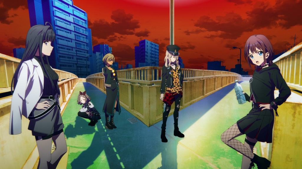
Only Underwater Nina and Doll Nina have much semiotic value, but man who cares, they’re all cool! The hands! The outfits! The neon eyes!
The animation is mostly 2D, with storyboards by director Kazuo Sakai. His shot compositions throughout the show have always had a great sense of depth and fun – a sense which to my regret is mostly absent from the OP. This isn’t through any lack of movement. The camera in the 3D concert segment never stops swooping and tracking and panning and, above all else: rotating. I don’t know what it is about 3D animated concerts that makes directors really want to rotate the camera, but I have to assume it’s a pathogen that spreads via exposure to AutoDesk Maya. Even as the camera spins around the performers and the stage, Sakai cuts to 2D Nina spinning around with the camera – and when she’s not spinning, she’s zoomin’.
It’s the intercutting that saves these camera movements from feeling like a script pulling from stock animations in an idol game. I think directors on idol projects are worried that if they don’t have the camera doing wild swoops and rolls, they can’t raise that ~wakuwaku tension~ but I think the entire industry should meet up for a giant nomikai one night and go watch Stop Making Sense. If nothing else, studying David Byrne’s movements would provide animators with inspiration and reference footage for decades. Really, most band and idol anime would be better if it were about the Talking Heads, but that’s neither here nor there.
I quite like the repeated images of Nina beaming and happy, out of her mind, hanging onto the camera for dear life as the background in bokeh zooms around her, singing about some intensely depressing shit. This is pretty good characterization for our young menhera. The rest of the band doesn’t get that much attention beyond some poses suggesting their archetypal “image” – again, the approach seems closer to an MV than an OP.
The sakuga parts are sakkan’d by Hiroyuki Saita, who is perhaps best known as the guy who drew that dance from the Mondaiji ED which got synced to Get Down On It by Kool & the Gang a few years back. This is no faint praise; that video rules. His most relevant experience is probably the nice lipsynced part of the New Game! OP, which also drew some well-deserved attention.
Unfortunately, something seems to have gone amiss for the Girls Band Cry OP, and I don’t understand why. The lipsync is very meticulous, but also very unnatural. The expressions are stiff, the faces and especially eyes distorting so little that I can’t say for certain whether it’s intentional or almost imperceptible douga melt. Nina blinks exactly once. I haven’t dived deeply into mouth shapes and performance animation, but when it comes to performance lipsync, my mind immediately goes to all the absolutely wonderful, expressive shapes from K-ON!(!) and its EDs, and of course the famous Live Alive performance scene from The Melancholy of Haruhi Suzumiya.
Now, I’m not going to sit here and tell you that Saita and the KA team should have “just” tried to animate like Yoshiji Kigami and Futoshi Nishiya, may they rest in peace, but I can’t help but feel that anyone trying to animate Nina putting her deep well of boiling emotion into lyrics should aim for something a little less doll-like.
-except for the literal doll-Nina, that part was fucking cool.
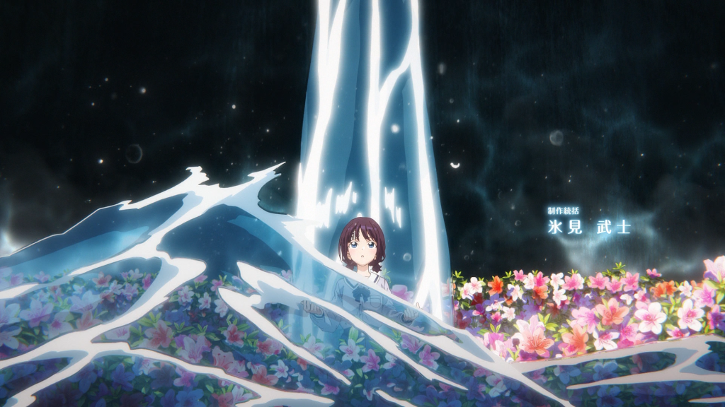
Jellyfish Can’t Swim in the Night OP
▷「irodori」
▷ by Nate A.M.
Director Ryouhei Takeshita loves talking and posting about YoruKura’s production. He hosted a twitter space every Saturday night to go over that week’s episode, and is the reason why very few of the uploads on the booru are credited solely to artist_unknown. The bad news is that I kept forgetting to join the spaces and now I can’t access any of the ones where he and his friends talk about the OP. The good news is that Kyuu (@rakyuugaki) has summarized at least some of their contents. Absolute chad. If this section reads like a hack matome blog entry based on Kyuu and Takeshita tweets, that’s because it is. Go thank him. Heck, go thank Takeshita too. Just, y’know, don’t be weird about it.
Takeshita chose to board and direct the OP himself because this project is his darling. He says he wanted to create a “face of the work” which embodies all its finer points, and he didn’t feel comfortable delegating that away to an OP specialist (see: Shuumatsu Train). I’d call his efforts a success: the YoruKura OP really does reflect the aesthetic and thematic core of the show – for better, and for worse.
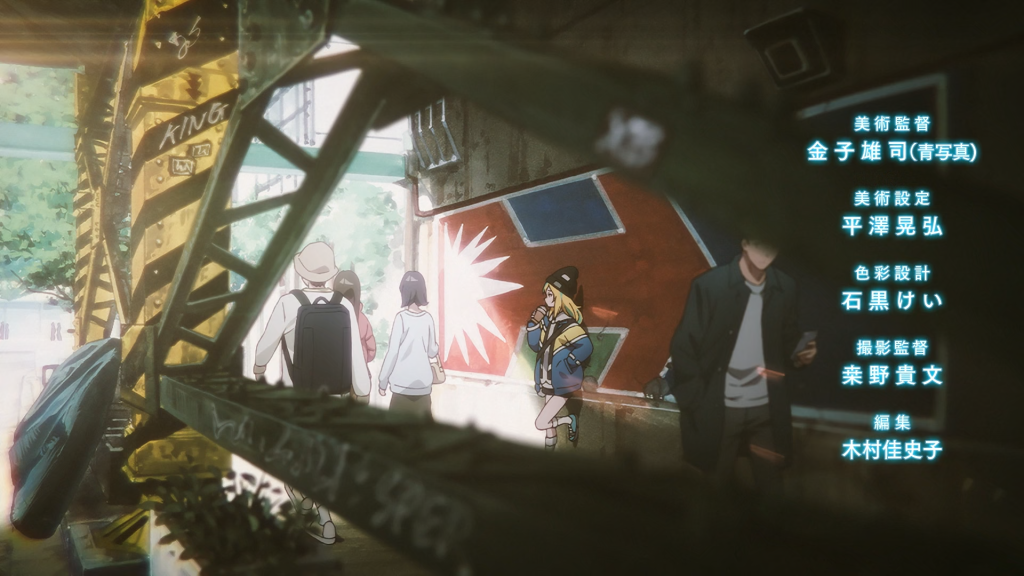
It’s fitting that the first episode takes place on Halloween, because this OP begins with a haunting: a haunting of the Ghosts of Bishoujo Past. It’s a visual expression of how all the protagonists are shaped in the present by the experiences of their past, and how these things push them to become the very mabushii, eminently tokubetsu people they desire in their hearts so deeply to become. This isn’t subtle – nothing in YoruKura is. I’ve criticized the show at times for lingering on trite metaphors which don’t warrant it, but OPs are exactly the place where otherwise trite metaphors belong – and in any case it’s honest advertising. I approve. The second half is about all the wonderful people and experiences to which their drive to become mabushii and tokubetsu opens them. In other words, it’s a buncha vignettes from the anime. However, you’re not here for my middling middle school book report; you’re here for the sakuga, and there is much sakuga to discuss.
The first item I’d like to steal are these Yuuji Kaneko backgrounds which Takeshita posted before one of the spaces.
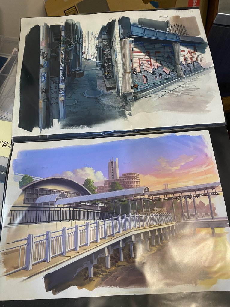
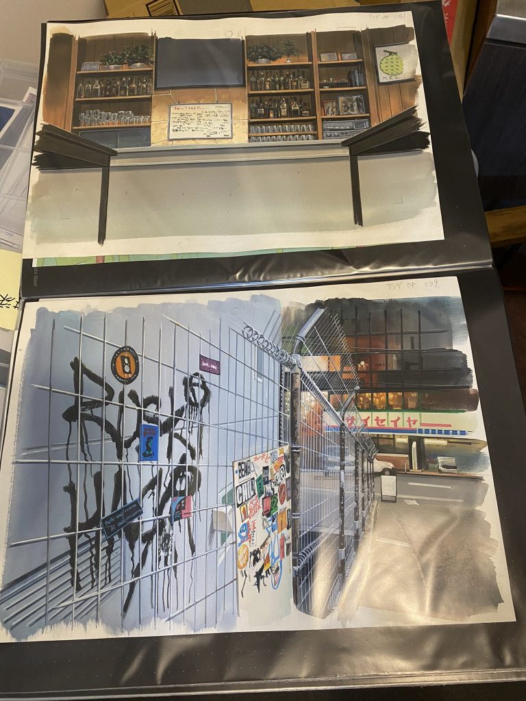
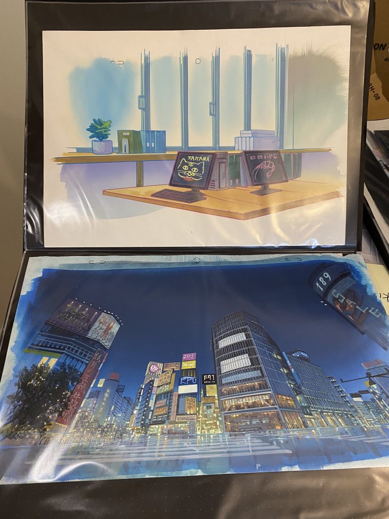
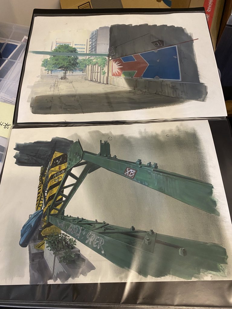
Aren’t they great? You just can’t beat the texture of these traditional acrylic backgrounds man.
Other blogs have discussed Kaneko’s career in detail, so I’ll spare you the recap. His focus for YoruKura has been on background details: things which give the environment life. Shibuya is dense. Many people who aren’t the protagonists of this particular cartoon live there. I think many of us were jebaited by the promotional material into thinking YoruKura would give more attention to Shibuya’s nightlife and the character of the city itself, but Kaneko’s backgrounds still bring a touch of texture to YoruKura’s otherwise unreal OP. Note for instance the tarp and plants on the lower beam of the bridge in the last set of backgrounds, and how the typography of the graffiti tags harmonizes with the color scheme of the bridge span itself. This bridge has lore. This bridge has seen some shit.
Compositing director Takufumi Kuwano had a say too.
In the analog era, directors of photography often over- or underexposed the image to alter the lighting and color, and this technique has continued to evolve in the digital era. All the daytime scenes in the OP are blown out, but this isn’t the result of overexposure: the dark areas appear dim as well. The entire image is washed out, or in other words, it has a low “dynamic range.” Dynamic range is the ratio of how bright the brightest part of the image can be without being pure white to how dark the darkest part of the image can be without being black (sorta). There are other ways to lower the dynamic range without blowing out the white or black areas, but this particular kind of low dynamic range is one of the defining quirks of camcorders and early phone cameras with CCD sensors. I have an old camcorder I could use to record an example, but of course, I don’t have to: Takeshita and his buddies did it for me.
Note how the weak-ish color signal of the tape leads to degraded, slightly blurry colors as well.
Camcorders might not be the only source of this aesthetic. Kaneko mentions in an interview that Takeshita gave him an old book of pictures of female voice actresses taken with a Fujifilm “Utsu-run” disposable flash camera with ISO 400 film, sold abroad under the name “QuickSnap.” These things were quite popular back in the day, but what kind of photos does it take? It has a fixed shutter speed of 1/140 seconds and fixed aperture of f/10, which gives it an EV of ~11.8: just about good enough for most daylight conditions. Its depth of field stretches from about one meter to infinity. Does this describe any shot in the OP? Nope! What Kuwano (and perhaps Kaneko) seem to have taken from this reference isn’t specifically the field of view, depth of field, or light sensitivity of the good ol’ Utsu-run, but rather the idea of imperfect photography in general. All of these references blend together into a sense of “vintage-ness,” which gives us our daytime exposure and color choices.
-and it kills me to say that in my opinion, it’s all for next-to-nothing.
As much as Takeshita and his friends talk about vintage photography, every daylight shot is overpowered by the sheer amount of bloom, god rays, bokeh, mild lens flare, and suspended dust. These things combine to create some of the most sparkly kirakira-ass cuts I have seen in all my years. The stupendous texture of Kaneko’s work is almost completely smothered. I don’t understand. Did Takeshita feel his girls didn’t shine brightly enough without them literally shining? Did he feel the romance of Shibuya wouldn’t come through without obscuring its identity as a real place? I don’t know. Takeshita talks about how much he cares about lighting – here for instance – about how he plans the lighting for each and every shot with copious location hunting. He talks about how lighting which doesn’t match the intent of the direction just ends up as tasteless nonsense! Indeed, the lighting in his OP is obviously too meticulous to not reflect his core aesthetic goals, but I don’t understand what those goals are. I wish I did.
The night scenes are more of a mixed bag: one or two are hazy rim-lit neon cliches, but the rest have some exceptional color use. It’s not just signs which cast the night in different colors: the color temperature of headlights, street lamps, restaurants, retail shops, and office buildings are all quite distinct, and these subtle differences create subtle gradations. The color of Shibuya at night can be warm in some places, and cool in others. You can moreover see Takeshita’s attentiveness at work very clearly, for instance, in this shot of the main cast backlit by the lights illuminating Mahiru’s jellyfish – the thing which set off the chain of events that brought them all together and let them shine. It also happens to be a very nice shot: colorful, but not gaudy.
The animation itself is nice. Kiui and Mei both have pretty distinct body language, which you can easily see here. It’s not sophisticated, but it’s there, and it adds to the scene.
My favorite individual cut is probably this one of Mei getting up from her piano and starting to run, mostly on account of the shadows. The long shadows cast on stage can behave very weird, and Shun Miyakawa captures their shape and movement quite well.
I admit, I skipped the OP for most of the broadcast.「魔法、いつから使えるようになるのか?」over Mahiru sitting listlessly in a dreamlike classroom as her younger self runs past was just too on-the-nose. I skipped the OP for the same reason I nearly dropped the whole show after only the first episode, but in both cases I’m glad I didn’t. It’s not that the show always rewarded this choice, or that the OP isn’t at its core tawdry, but both in the end were worthwhile. I understand that all this is incredibly backhanded, but I truly do enjoy watching anime which has deep thought and an ethos behind it – even if I don’t always appreciate the ethos. I enjoy it even more so when the staff talks so openly about it – with so much obvious joy and pride. I’m actually tearing up a bit thinking about it (oh god oh fuck the kitsch is coming from inside the house). I salute Takeshita, Kaneko, Kuwano, Taniguchi, and everyone else involved, and hope that I have more positive things to say about the next thing they make.
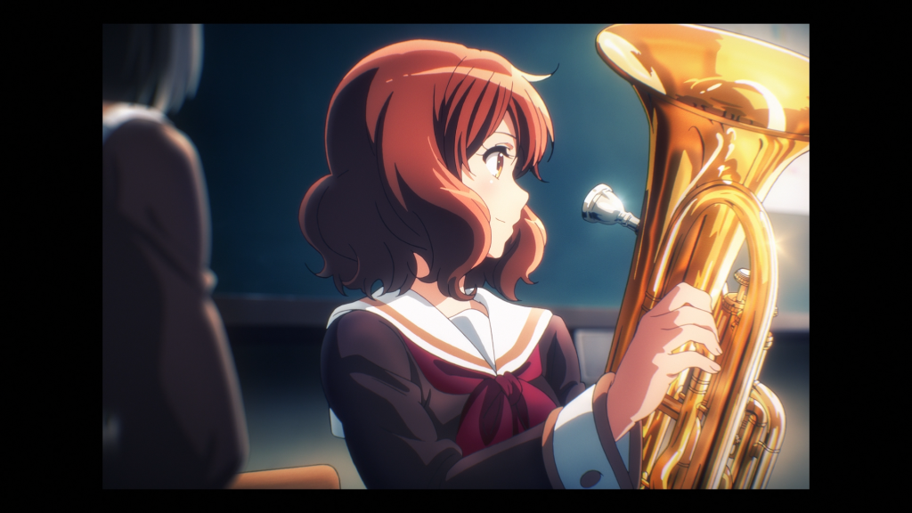
Let the Euphonium Ring! S3 ED
▷「ai no aisatsu」
▷ by Nate A.M.
If I had a hundred yen for every member of the union of the set of recent band anime written by Jukki Hanada, recent band anime about fair-haired musicians who get dragged back into music after trying to leave it behind, and recent band anime that required me to research cheap film cameras, I’d have 300 yen. That’s not a lot, and given how weak the yen is nowadays, I’d really rather have it in USD anyway.
I dunno, ‘s cute.
Ai no Aisatsu, directed by Takuya Yamamura, continues Haruka Fujita’s aesthetic cues from her Vivace! ED, but adds a new layer of substance. Light pastels! Implied barefoot frolicking in green prairies! Kumiko, Hazuki, Sapphire, and Reina make cutesy poses in front of piano-themed fences with custom painted AGFA Photo reusable 31mm f/9 film cameras.
“The magic of film is making a comeback!” say AGFA. It would seem the anime industry agrees. In fact, I think KyoAni and AGFA should partner to make a SKU of these things. Heck, I’d buy one: they look great! You solve the problem that these things are basically fashion accessories by making them actual fashion accessories.
Unsurprisingly, most of the ED is photography-themed. Tatsuya Ishihara is an avid hobby photographer, which is something he shares with much of KyoAni’s key staff. Illustrations like this one show a deep understanding of light and excellent communication between the animation and compositing teams.
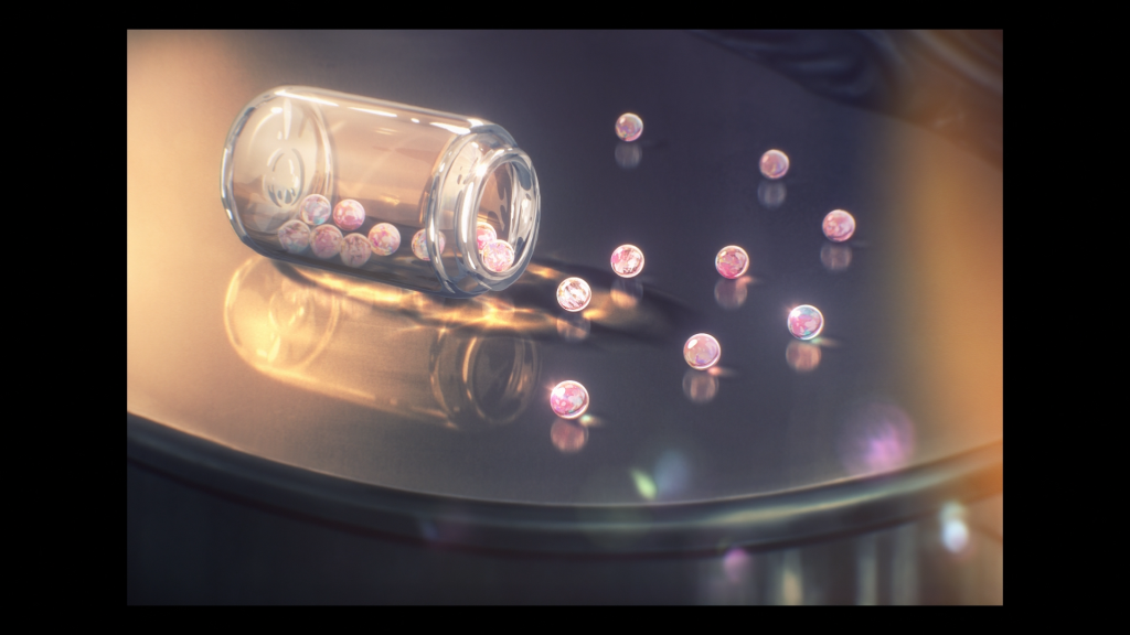
Yamamura has used marbles as a motif before, and Yuyucow suggests that it “mirrors the multifaceted relationships within a group of friends.” That seems like a fair reading, but he neglected to draw the idea to its logical conclusion that the Kitauji HS wind ensemble is in the process of losing its marbles.
Just like YoruKura, these images are playing a bit with the lens’ depth of field, but the slightly dark indoor exposures and narrow field of view are just about right. The idea is to show the main characters as they’ve developed through Elementary (pre-K?), Middle, and High School. It’s an appropriate note for the final season.
The drawings in this ED come to us courtesy of Mariko Takahashi, who keyed the whole thing. Her career has taken a winding path from douga, to genga, to sakkan, back to genga, and now once again back to sakkan – I suppose due to the exigencies of post-arson KyoAni. She began her career at Animation Do in 2000 – nicknamed “Do’s Takahashi” so as not to confuse her with the late Hiroyuki Takahashi – but now finds herself with everyone else at the main branch. She’s been known for her skill at polishing and cleaning drawings for a long time, and this ED, with both its technical challenges and focus on making its characters look stylish and cute, is a good place to show off this clean draftsmanship. Her former coworker and current Nintendo cinematic director Tomoe Aratani would be quick to point out how much personality her drawings have beyond the mere draftsmanship, and it’s true. It’s even more visible in her illustrations – I’d highlight the drawings she did for the Suzumiya Haruhi calendars in particular.
Of course, chief animation director Kazumi Ikeda had a pass at it too, as did career inbetween checker Naoko Fujita. If you’ve been paying attention to KyoAni affairs, you’ll know that they have quite a number of respected career inbetweeners, and that the core staff correctly involves them in the process as important team leaders the same way as they involve the animation directors. Where else could you search a dougaman’s name on twitter and immediately find a story about Naoko Yamada asking them to draw the Koe no Katachi characters rounder? What other official account would shout out a dougaman not once but twice? I’m sure she’s on their staff blog, but I haven’t the faintest which pseudonym is hers.
The ending of Let the Euphonium Ring! S3 is the second least interesting thing about the show, and it feels weird that this is what I’m writing about. It is, however, my favorite ED of the series and an excellent end note for an excellent cartoon. Eupho TV has approached nearer and nearer to perfection – 理想さ in the same sense Toshiyuki Inoue used to describe K-ON! – and yet it’s also always had a veneer of kitsch. It stumbles at times, but it stumbles spectacularly. It’s one of the greatest, most fascinating TV anime ever made. Perhaps one day I’ll write about it.
Just not today.
Jean Faymas Season 3D
▷「Radiance Project」
▷ by Nate A.M.
>very funny KB
No, listen, I saw this a few days ago and I had to include it. This shit’s AESTHETIC – and that’s what I want to talk about. It’s an expression of the difference between “worldbuilding” and「世界観」– and why it matters for a vtuber.
-and after all, this is an opening animation: an OP for vtuber Jean “Jets” Faymas. Its purpose is to set the mood and look cool while she finishes getting ready for a stream. This makes it different from anime OPs because it doesn’t need to introduce any themes and needn’t make any attempt at pacing; it can end at any moment or loop several times. It doesn’t introduce Jets as a “character” through any of film’s normal set of characterization tools – but it does introduce her taste. More than anything, this OP is about what Jean Faymas thinks is cool.
She puts it this way: she divides the imagery into two categories, which I’ll paraphrase as “lore” and “chuunibyou.” The “lore” parts are mostly visual callbacks to a video she illustrated for Season Two – that is, things which are supposed to be literally true about “Jean Faymas:” Pilot 237, the cyborg clone created by Cynapse to fight kaijuu in a giant robot. The “chuuni” bits are mostly anime and game references, which span from Ghost in the Shell to Signalis to Serial Experiments Lain to Severance.
If you aren’t familiar with Jets, it’s almost impossible to tell which are which. She has a big character lore document for herself, but communicating that information isn’t the focus. What then is lore to Jean Faymas? Jets cares about her own character lore, but not because she constantly references it on-air. Many vtubers – especially corpo vtubers – have lore which they then mostly ignore (except when it’d be funny). Anyone who is old enough to remember the era when every youtube shoutman with a media review channel had a desperately unfunny ongoing storyline will understand why this is a good thing. Instead, if I’m not mistaken, the importance of lore to Jets is twofold:
- As something to underpin the visual aspects of her character and stream setup
- Because she thinks the fact that these lore details exist is cool and writing them is fun
This brings me back to「世界観」. “Sekaikan” is often translated as worldbuilding, but it’s closer in sense to “ethos.” It’s not just the setting details, but the broad aesthetic principles which drive the whole work. While Jets describes the OP as containing lore, this is not an exercise in worldbuilding so much as sekaikan. But then, this isn’t a work of fiction. The aesthetic project is Jean Faymas. The aesthetic project is pure self-expression.
-and that’s part of what’s cool about being a vtuber: it’s a more radical form of self-expression than any other form of streaming that I know of. I find that most people think of vtuber “characters” in terms of anonymity and artifice – as something in tension with honest self-expression – but Jets uses it as a way to express and share. I don’t think this takes on a particularly personal nature for Jets, but a different vtuber might use the artifice of their character to show some aspect of how they see themselves, or how they’d like to be seen. Even Jets sometimes seems to go back-and-forth on the details of Pilot 237 based on how she happens to be feeling at the time. This is, of course, an extremely common motivation for author self-insert characters in fiction, but the context of performance art – to actually become the character – is something quite different.
I am being incautious. Jets credits herself as “director,” to which she should’ve added “character designer,” but this isn’t her work alone. In fact, it’s not really her work. The workflow was very simple: Jets got to talking with CG animator Freedin Mettle, she passed him a whole bunch of notes about things she thought would be cool, and he went off and did his own thing. They seem to respect each other a good deal, so it worked out perfectly for both.
The animation itself is very simple. This is a shader-centric OP. In fact, the monocolor backgrounds, simple animation, reuse of assets, heavy focus on reflections and glowing elements, general lack of pacing and structure, and music bring to mind 64k PC demos more than anything else: a type of demo which heavily leans on shaders since really what else are you going to fit in 64 kilobytes of data? I say this not because I think Freedin or Jets are big demoscene nerds (yet) but because that’s the nearest referent I can think of. It should be noted that while the OP is mostly mecha and cyberpunk references – and even the original images draw heavily on the same reference pool – they don’t copy the color palette or lighting of the referent. That’s what gives the OP a consistent atmosphere despite being a collection of vignettes.
Anyway, Jets is cool, go watch her.
Some of the OPs and EDs we didn’t get to include Blue Archive and Karasu wa Aruji wo Erabanai, and they’re both quite interesting. The Blue Archive OP is an absolute montage whirlwind of vignettes trying to show off as many characters and situations as it possibly can at the expense of legibility – almost as if looking at the screenshots on twitter were an intended part of the experience and the purpose of the images for the rhythm of the montage and their purpose of them as actual legible images were completely seperate. Geth had some unkind things to say about this strategy, but whatever you think of the result, it’s a fascinating case study.
On the other hand, the most frustrating part of the Yatagarasu OP is that NHK has ensured we have no idea who worked on such a cool opening. It plays with all kinds of techniques like time lapse photography to tie in with its seasonal and weather imagery and communicate its overall theme, which unfortunately I can’t talk about myself because I didn’t actually pick up the show. So it goes.
Unfortunately, that’s all we have for this season. You’ll get Geth and Dandy back next season, and all will be right in the world.
(hopefully this time it’ll be done before the summer season ends)