A companion to this interview.
Director Christophe Ferreira, Qubic Pictures producers Justin Leach and Katrina Minnett, Orange producers Yoshihiro Watanabe and Kiyotaka Waki, novelist Scott Westerfeld, and vocalist Diana Garnett came to Otakon in order to tell us about their cartoon called Leviathan, and now I’m here to tell you what they told us.
-but not everything, because the panel was an hour and a half, and this is a sakuga blog.
Leviathan is an adaptation of an American YA novel funded largely by American companies, with a French director, produced at a Japanese studio, about fictional Britons and Austrians. In Scott Westerfeld’s novel, Charles Darwin not only establishes the principles of evolution, but by some Turtledove-esque The Road Not Taken twist, also discovers DNA and how to easily sequence and edit it with mid 19th century tools. This miraculous discovery led to equally miraculous energy-dense and work-efficient bioengineered “beasties,” which served the functions that mechanical devices did in our world – but only in the specific countries that would ally with the Entente during the Great War. Germany, though in reality the birthplace of 19th century biochemistry, is in Westerfeld’s world overcome by a fit of American Evangelical reaction and rejects the “Darwinist abominations.” Instead, they build mechanical imitations of Darwinist beasties called “clankers,” as do the rest of the real life Central powers. Despite this swirling ideological hurricane and profound change to the material conditions of everyone living in the industrialized world, the politics of Europe during the Belle Époque seem to play out more-or-less identically for them as they did for us. All this creative energy seems moreover to have inspired both the Darwinist and Clanker powers to anticipate interbellum armor doctrine such that on the eve of the July Crisis, both sides are fully “mechanized.”
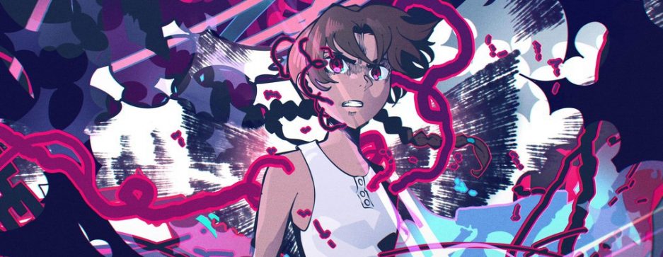
Leviathan is a cartoon about flying whale airships and giant robots stomping along to Preussens Gloria.1 It looks cool as hell.
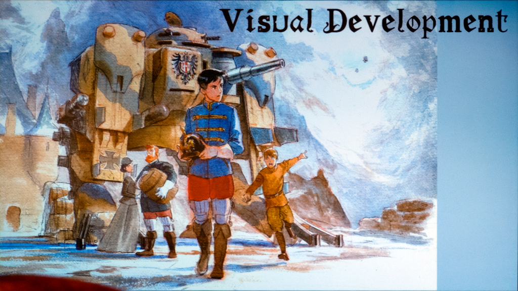
Westerfeld clearly had strong aesthetic ideas for what Leviathan should be, and he talked us through part of their development. Years ago, he was surprised to discover that his first major work, a YA dystopia called Uglies, was localized into Japanese as a light novel with illustrations by Kazuaki. He thought this was the coolest thing in the world and immediately wanted to know why English language novels weren’t illustrated too. To his surprise, he discovered that once upon a time: they were. Popular literature from Sherlock Holmes to Wuthering Heights featured handsome black-and-white prints, and it was only the contraction of the illustrator market with the proliferation of film cameras that ended it. I haven’t verified the historicity of Westerfeld’s claim, but it inspired him to work with illustrator Keith Thompson on some excellent period artwork for Leviathan.
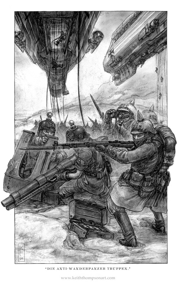
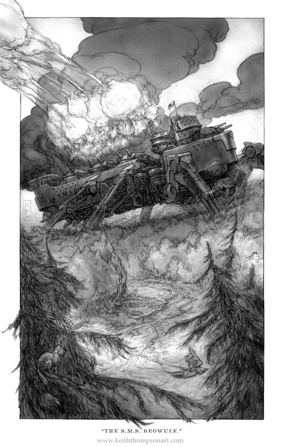
I quite like the strange onion-shaped muzzle flashes of SMS Beowulf as she fires a full salvo, and the expressive wispiness of the trees themselves as they’re twisted and blown by the immense pressure wave of her repurposed naval guns. The shapes remind me somewhat of Kazunori Ozawa (this is a compliment). It’s also funny in a subtle way how the use of negative space in the composition here should be very traditional, except that Beowulf is too big to actually fit in the space, and the huge shadow she casts over the trees draws a line that slices the composition in two pieces and breaks the effect. SMS Beowulf is a concept so crazy that it breaks traditional composition: a true super robot.
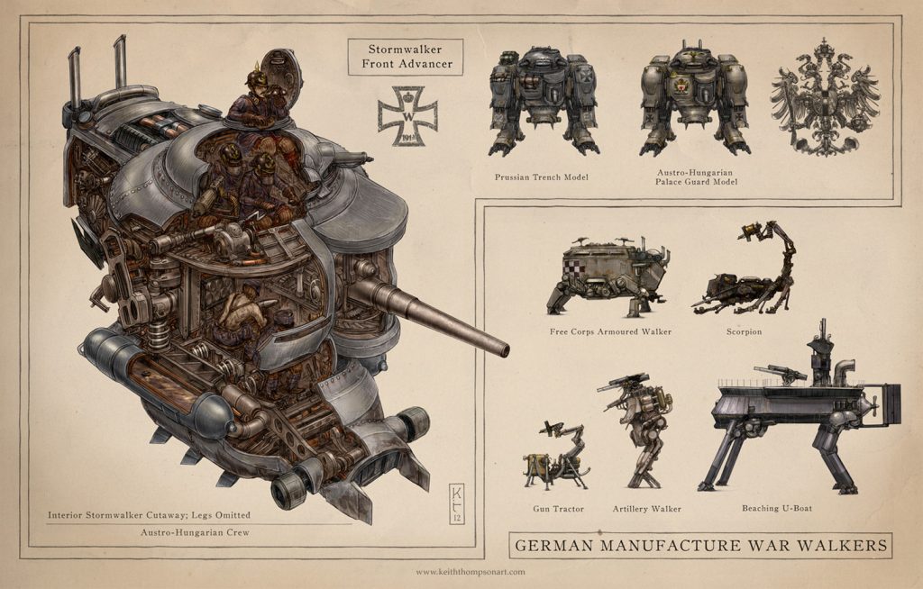
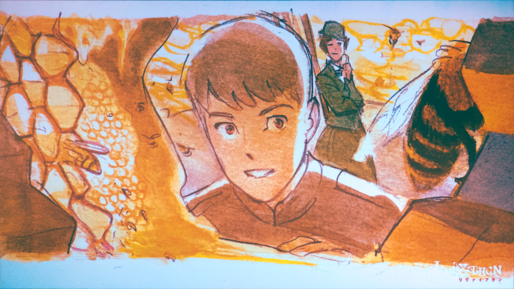
More importantly, note the drawing of the Stormwalker’s interior. Prince Aleksandar of the Austro-Hungarian Empire, one of the two main characters, drives a Stormwalker. According to Westerfeld, Thompson’s design gave him a new perspective on how it must be like to crew one of these things operationally, which completely changed how he wrote those scenes. AFVs of the Great War were notoriously unpleasant to operate, and Thompson’s design drives home the point. This is a classic example of the feedback between mechanical design and other elements of storytelling: a virtuous cycle, if you can keep it.
In that sense, I believe director Christophe Ferreira when he claims that his first impression of Leviathan was that it was already anime.
Qubic brought M. Ferreira into the fold before they approached Orange as the primary contractor. With refreshing frankness, he told us he didn’t even want to do 3D. He has experience with 3D, but his first love is 2D, and he’s acutely aware of the shortcomings of bad 3D work. Mr. Leach, who began his career as a 3D artist on shows like The Clone Wars, had to convince him. Given the unavoidably complex dieselpunk mecha, biopunk beasties, prop, creature, and even character designs, it’s not hard to see how Qubic won the argument. M. Ferreira was previously part of the core staff of Hirune Hime, which had some similarly complex designs and was only able to avoid relying on 3D by enlisting the aid of A-list film realists. The Leviathan cartoon would be 3D, or it would be nothing. However, if M. Ferreira was going to direct it as 3D, he’d make sure it was the best 3D he and Qubic could manage.
Luckily, it turns out Orange is about a two minute walk from M. Ferreira’s home.
(yeah I’m serious, apparently Watanabe-san saw M. Ferreira taking a walk with his kid in front of the studio one day and was like “wait, you live here??” fate!)
What does this mean in practice?
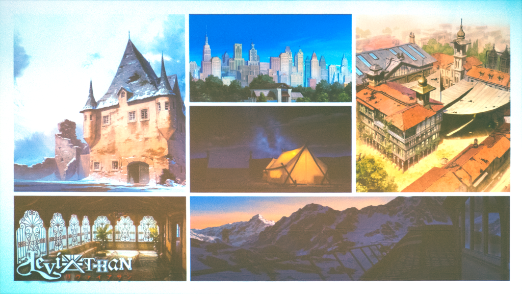
The first idea M. Ferreira and Orange had was to make the anime look like Keith Thompson’s period illustrations. Hiroshi Nagahama, most of whose panels I unfortunately had to miss, could probably attest to how difficult it is to make an anime like that – let alone make it look good. Uzumaki is a useful point of comparison, because motion is arguably where the aesthetic experiment falls apart: line control issues like the amorphous hair and the constantly shifting cross-hatching, but also other areas where Nagahama and his staff seemingly had to compromise. When M. Ferreira said that making Keith Thompson’s aesthetic look right in motion would’ve been impractical without film level funding, I imagine these are probably the sorts of problems he and Orange were facing.
This early phase of development involved a lot of color scripts which M. Ferreira and an unnamed illustrator worked on – though he referred to them by their western term of art: “image boards.” Studio Orange is rather unusual in the anime industry for placing so much emphasis on image boards, but M. Ferreira had plenty of experience with them during Hirune Hime.
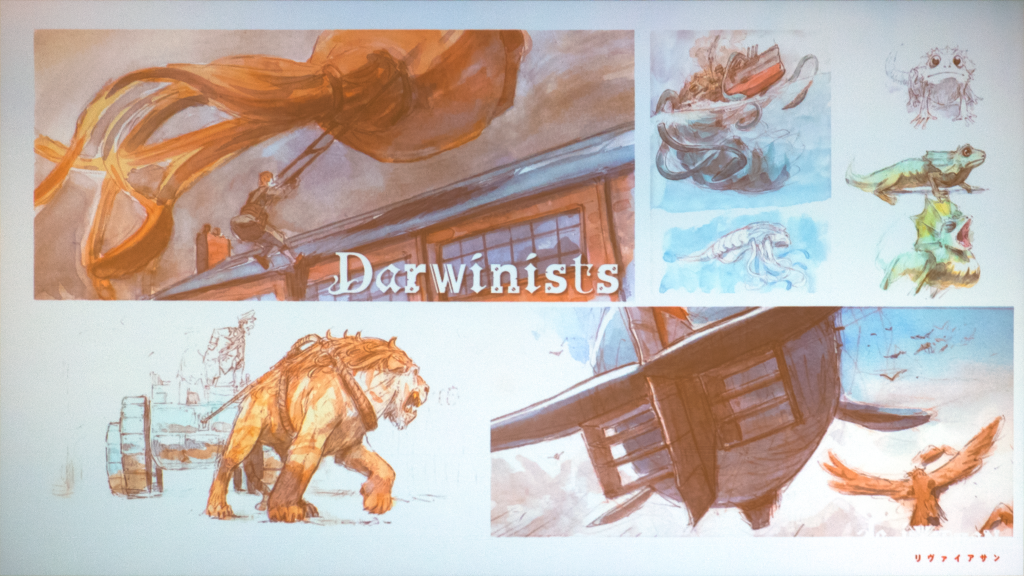
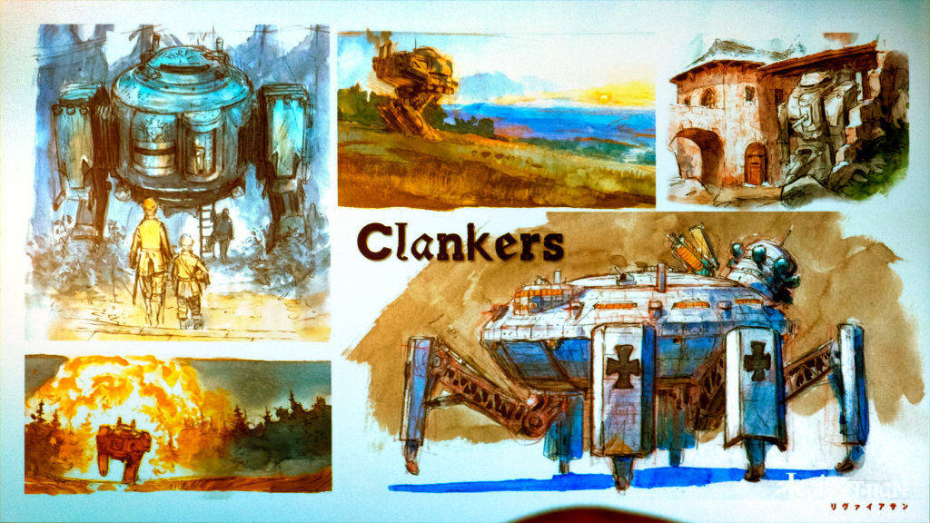
They inherited a set of decisions which Mr. Westerfeld made when he commissioned his original illustrations: that the Darwinist cultures should have props and architecture with Fibonacci spirals and warm colors, whereas the Clanker cultures should be blocky, with greebles everywhere and a cooler palette. These are nothing if not old and venerable aesthetic choices, but there is a basis for the colors. The Imperial German army of 1914 really was famous for their feldgrau uniforms, whereas the French infantry really did go off to war wearing blue coats and red pants, the Commonwealth had their “dusty canary” khakis, etc. “Warm vs cool” isn’t a bad place to start, especially once you appreciate the incredible variety of colors and patterns and hats and kit – and my god I haven’t even gotten to the cavalry! The Great War really should’ve been “the war to end all war,” because all the militaries of the world have been absolutely unable to produce uniforms anywhere near as kino as they did from 1914 to 1918 – although the color swatches they wear in Ukraine for easy identification are a step forward! Given the amount of fires-centric positional fighting taking place along the Donbas, Kharkiv, and Zaporizhzhia fronts (I am writing this in September 2024), some parallel evolution is only to be expected.
I’m sorry, what was I writing about?
Anyway, my point is that coming up with good color palettes is complex. M. Ferreira gave goggles as an example. Both Alek and Sharp – the novel’s second protagonist – have goggles which are made out of roughly the same gray material, but not the same gray. The goal was to have the two truly feel like they’re from distinctly different cultural contexts through pure aesthetic cues while still emphasizing that they do indeed exist in the same world. This is thematically important.
Unsurprisingly, verisimilitude came out as a strong theme – but not all of it was driven by the reasons you’d expect. Keith Thompson’s mechanical designs had to be adapted into animation, which means all the parts on the clankers had to be able to move without clipping into each other. This would still be true in 2D animation, but it’s even more important in 3D where it’s harder to cheat – although in retrospect I should’ve tried to ask if they use the same tools that they use for their human characters to skew the mechanical objects based on perspective. Just as the initial design process with Keith Thompson clarified for Mr. Westerfeld how he wanted to write those scenes, so too did refining the designs for animation make them feel more like real environments. This is all quite fortunate, since our characters spend a lot of time on the Leviathan and in walkers. M. Ferreira admits that he doesn’t much like doing mechanical design, but fortunately for him, the veterans at Orange very much do. For those with shorter memories, Orange didn’t make their reputation as the Houseki no Kuni studio; they made it as perhaps the best 3DCG mecha studio of the late 00s and early 10s. Leviathan marks something of a return for them.
Orange is well-equipped for Leviathan in one other aspect: their in-house backgrounds. If M. Ferreira couldn’t have 2D animation, he would at least make sure the 2D backgrounds were the best he and his team could achieve. On this, he and Kiyotaka Waki were in perfect agreement. In the words of Watanabe-san: they wanted to “bring the backgrounds to the foreground” in a way where imperfections couldn’t be hidden anymore. This desire for wide vistas is one of the considerations which motivated their choice of cinemascope aspect ratio instead of 16:9. As you can imagine, this involved a lot of retakes, and M. Ferreira wasn’t shy about admitting it. He seems quite proud of the result.
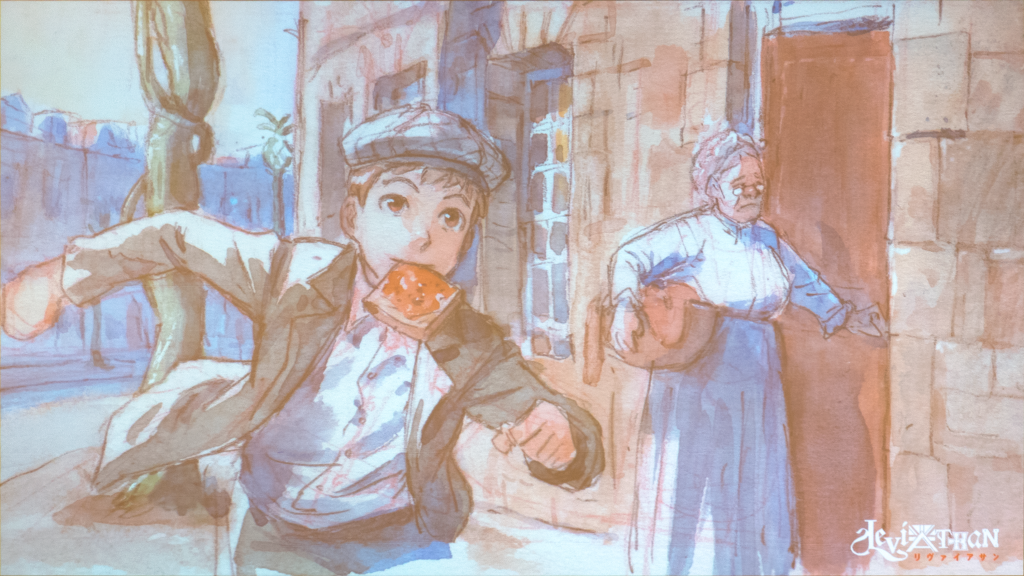
The desire to give Leviathan a sense of place not just in geography, but in time, extended to the music. Sharp and Alek both come from societies with a different, pre-phonograph, relation to music from our own. Daily life in Victorian and Edwardian England involved a lot more singing than you probably think – around the house with your family, while out drinking, and of course at Music Hall. On the other hand, as a member of the Austro-Hungarian aristocracy, Alek receives lessons on the violin and piano. Folk melodies of the sort Sharp might know did often find their way into the Romantic, nationalistic compositions of the period which a child like Alek would be learning (deeply ironic as it may be for the scion of the Austro-Hungarian Empire in 1914). Not only does this have exactly the thematic implications you’re imagining, but it also gives a sense of reality to the world by implying a shared history which extends back many decades beyond the events of the cartoon – or at least, that’s the idea.
Qubic is understandably quite proud that they were able to hire Joe Hisashi for the incidental music and ED. Reading between the lines, it took quite a bit of effort to nail down the deal, but nail it they did. Diana Garnet – the vocalist for the ED, noted utaite, and highly cultured vtuber – gave an impressive live karaoke performance. Regretfully, I am no more capable of transcribing a chord progression without awkwardly sounding it out in GarageBand than last time I had to write about music for a sakuga blog, but its melody start as a fairly typical modern, A-minor fantasy ballad, before resolving itself on the Greensleeves-ass i-V-i passamezzo antico, giving it a cool English folk song twist.
…I think?
It’s really good! Ms. Garnet is looking forward to all the utaite covers, and so am I.
More relevantly, Ms. Garnet’s performance was accompanied by a look at some footage from the anime – some of which was in the trailer, and some of which wasn’t. Earlier, M. Ferreira had talked about how he wanted to use 3D camera – or more to the point, how he didn’t. He didn’t want the cartoon to be full of flashy camera movement. This makes sense given his emphasis on 2D backgrounds, but I also understand him to have meant that in the 2D anime pipeline, you can’t have ostentatious camera movements outside of a few highlight cuts due to the difficulty of animating the background and keeping characters on-model. Flashy camera movement outside these key moments would place Leviathan firmly outside the anime visual lexicon: a lexicon which is generally built on restraint. On the other hand, M. Ferreira made good use of 3D’s ability to enable shot compositions with depth, where characters move from the foreground to the background. He explains his mindset more fully in our interview.
The animation itself was quite keen. Earlier, Waki-san walked through Orange’s pipeline. The overall flow isn’t anything that hasn’t been reported elsewhere, but there are a few things that stuck out. First, most of the time spent on character design was spent nailing down how to skew the model based on perspective through their range of expressions. While I still can’t answer the question a game developer asked last year about whether they use shape keys or bones, I can tell you that the name of their internal plugin is “automorph.” Each character is the result of three to six months of automorph passes, checking the result against the 2D expression sheet, and sending it off to the character designer to pass back notes. Oddly, there was something in the contract that stopped them from naming the designer except that he’s a well-respected industry veteran, but I’m sure we’ll find out soon enough.
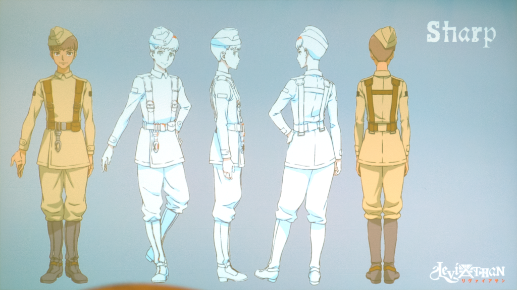
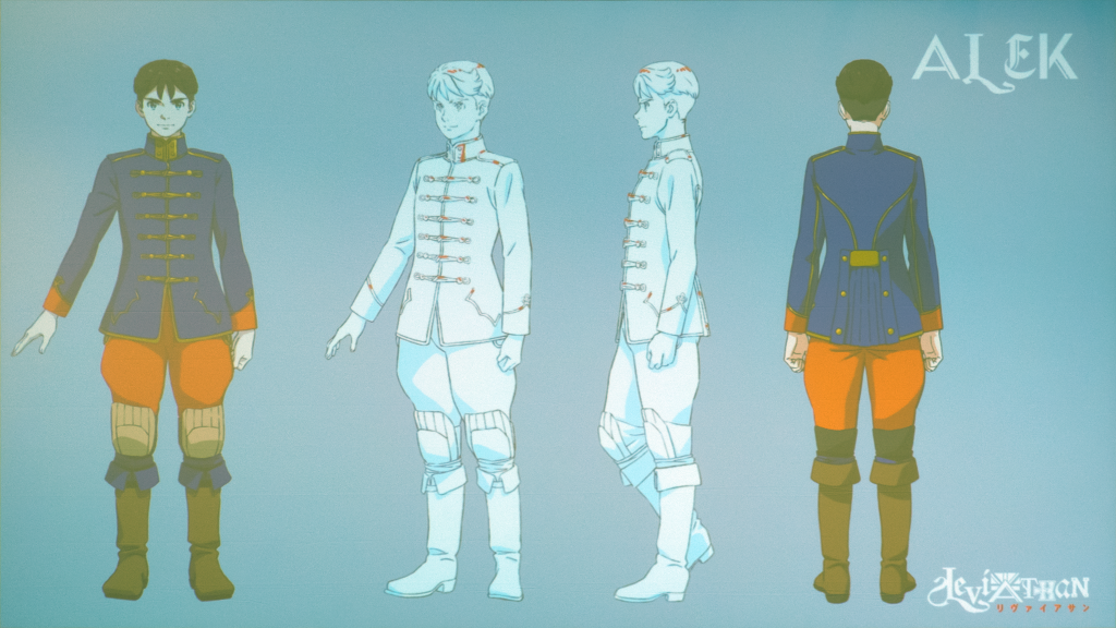
Alek and his retainers wear uniforms based on Austro-Hungarian cavalry. It makes sense given that the Wanderpanzern appear to be attached to the cavalry rather than the artillery or engineers, and also the cavalry’s historical connection to nobility. What’s interesting to me is that for as fancy as their uniforms are, Leviathan’s staff have considerably toned them down from the real thing. These were fancy fellows. I wonder if this was a practical decision, if the core staff thought that such a complex design was too un-anime, or if they simply believed that viewers wouldn’t accept that the Austro-Hungarians hussars really did ride off to fight the Russians decked out in gold trim. This would’ve been a good thing for me to ask M. Ferreira if only I’d remembered.
Cuts are handled by individual animators. Using mocap data as a base, the animator will make their own keyframes, pushing the poses and timing to alter the feel of the cut and express their intent. They also have a great deal of control over lighting, highlights, and shadow – seemingly more than a 2D gengaman has with a typical layout. Waki-san reasons that this is important due to how much of an effect lighting on faces in particular can have on character animation and atmosphere. He continues on to talk about how even effects animation and explosions should be leveraged to convey emotion and information. As someone who later that day would give a presentation on the evolution of explosions in anime, I completely agree.
This is usually where I’d document the Q&A segment, but it was short and nothing of note came up.
If you haven’t already, I recommend you check out our interview with Christophe Ferreira, which I greatly enjoyed. My apologies that our Otakon coverage has been so incredibly slow in coming out, but we do have some more – including more about Orange and the fascinating pipeline they developed for their IDOLiSH 7 concerts.
Footnotes: