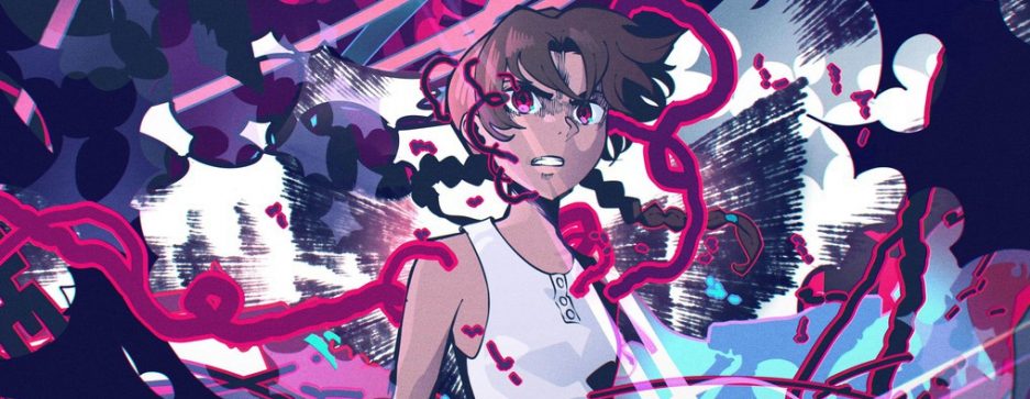
I just happened to be taking a closer look at the career of Yuki Yase on a whim and this scene from Mekakucity Actors managed to catch my eye. It’s the last episode of the series so naturally he handles the board and direction.
Animated by Tomohiro Shinoda, it should come as no surprise that it moves as well as it does given his pedigree as one of the most interesting action animators around. The effect shapes, constructed from a square-centric perspective are a staple of his work, especially when paired with those loose, shorthand drawings and generous smears.
As great as Shinoda is however, the reason this scene grabbed enough of my attention to write about is instead the direction of Yuki Yase and his very particular positioning of horizontal light flares. So with that said, lets take a closer look at a few of them.
The first pair of flares intersect the middle of the screen and serve to anchor our laterally moving character. Like a train through its tracks, the clearly defined center point of his shirt travels the length of the course while both hands reside on either side in the pursuit of symmetry.
While the previous was more about directing our attention, the focus then shifts more towards balancing the composition of the shot.
Starting with the first cut, Yase enacts the rule of thirds. There is a certain visual clarity gained by organizing the frame into equally spaced segments, with the light flare marking the top third while the characters and debris fill the other two. Also notice any staging attempt throughout the entire scene occurs horizontally, the same direction as the light flare even though vertically arranged thirds are equally viable and maybe even more common.
The second cut is simple but effective. Its purpose here is to provide a reference point, along with the background, as the character grows into the camera. Meanwhile, the last cut in this sequence follows the motif of the very first one we looked at with the discarded body flying between the occupied empty space at the top of the screen.
Finally, we again return to Yase’s thirds and unsurprisingly the frame is creatively divided, with the layout skewed such that the two sheltered characters are watching from the bottom third while most of the focus falls on the antagonist.
The choking cuts towards the end are more of the same. Always placed at heights matching key points of the drawn elements to serve as a type of scaffold for the frame.
This type of active participation on the part of a director is something very much tied to the SHAFT identity that Akiyuki Shinbo managed to propagate before watching it spread to so many others. And although Yuki Yase never had the most ideal situations for his more ambitious efforts at the studio, its not all that difficult to spot the seeds of inspiration that would later grow to fruition throughout the first two cours of his more recent success on Fire Force.
