Welcome to a new column on this blog where we take advantage of the piecewise format to finally produce blogging that embodies the true spirit of the unknown artist. Ideally, future iterations will see increasing variety in participants, as people are matched to their specialties and interests. The nature of openings is such that there will always be something relevant to talk about. This season just happened to be loaded, and thus, a tradition has been born!
Hopefully.
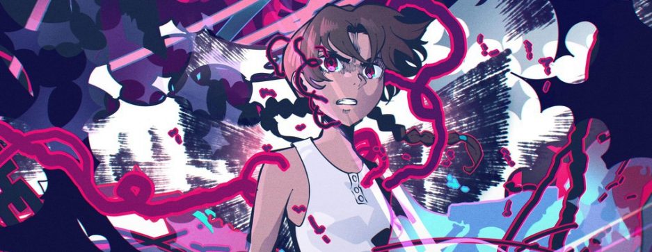
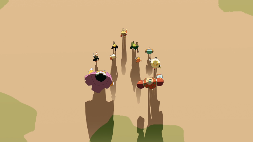
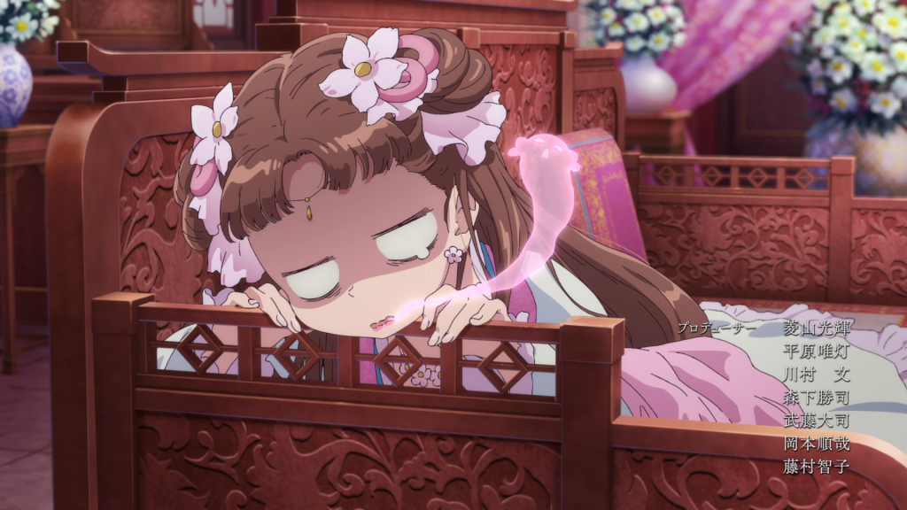
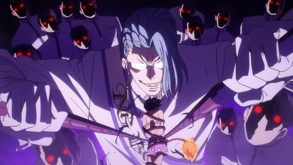
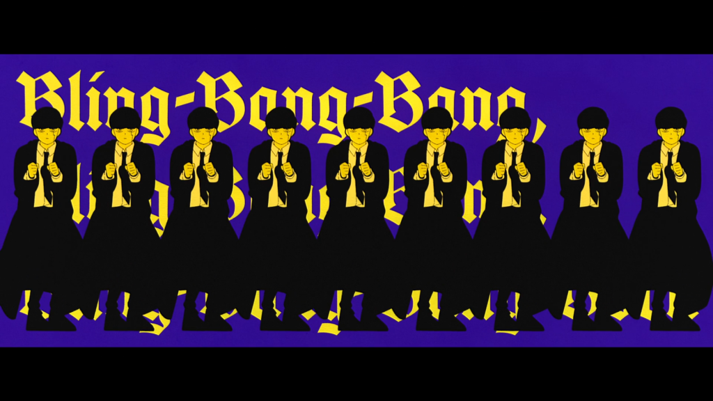
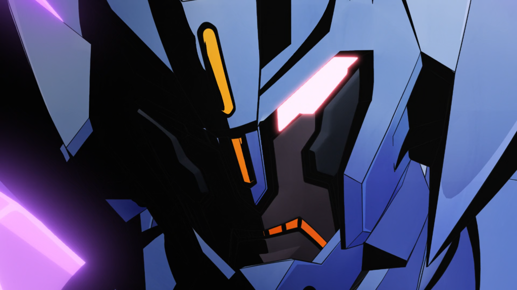
One Piece OP26
by Geth
If you showed this opening to a One Piece fan in 2002 there is a genuine risk that their brain would melt out of their nose.
Even as a non-One Piece-anime watcher, it has been fascinating to follow one of the largest prolonged transformations a series has made to its production philosophy, since maybe ever? It’s a topic that sits at a massive scope, and to truly capture every factor involved would also require an intimate understanding of closed-door business dealings at Studio Toei. We can infer from the results that One Piece became the largest priority for the studio, but also credit to the individual artists and production staff who have served as the catalyst for this change. A change that has reached the point to where the series has paved the way for creators such as Megumi Ishitani to express themselves at a seemingly uninhibited level. Even the length of the opening, previously a limitation exclusive to One Piece, has been lifted for a standardized ninety seconds of inspiration.
The vanguard from the drawing side is Masami Mori. History will remember him as the central figure in this aforementioned transformation throughout Wano Arc and beyond, however, I sense that his passive influence as a drawing superstar has extended far beyond the boundary of One Piece and even the studio in which its made.
It’s such a densely packed opening that I am no where near equipped enough to speak towards the specific details and features. However, it would not make sense to publish a post on the opening class of Winter 2024 without at least nodding towards the far and away best one.
Sousou no Frieren OP2
by Geth
There is a fascinating narrative running concurrent to Frieren’s polished production: director Keiichiro Saito, in a way wholly departed from most of the rest of the industry, is reluctant to indulge in gratuitous action animation. If it wasn’t evident enough by the chorus drop of the first OP, he returned with the second as if to say, “yes, that lukewarm long panning cut was intentional.” Saito’s philosophy is even evident outside of Frieren’s opening sequences. Aside from a few Stark exceptions, it has been amusing to witness a shounen anime that is actively de-prioritizing show-y, extravagant action, especially considering that Saito has abundant access to some of this industry’s strongest action animators through super producer Yuichiro Fukushi. (As of writing, the second stage of the tournament appears to be where all the action resources are concentrated, which is its own topic on expert management, but still, it is fair to expect an unorthodox approach taken to straightforward fighting).
With that said, despite being featured in a shounen magazine, and thus carrying the all-important label, Frieren’s source material does not have the same priorities as many of its contemporaries. It’s exceedingly contemplative (often to a fault), and quick to prolong character exchanges in the interest of world building. Its theses features that Saito appears to have picked up-on, and subsequently chosen to showcase at a higher priority than the action. The added caveat to this approach is that the show is much more stable from an animation quality perspective than it otherwise would be with faster pacing and constant action, again speaking towards the management, which deserves praise.
An opening is comprised of more than just its chorus drop, however, and there is much to like about the surrounding parts. Saito has been around long enough at this point that his sensibilities have solidified into a core-identity found in the color direction, use of overlap, and use of negative space.
The rapid cuts after the chorus share a common theme in that they sequentially feature only the newly introduced tournament arc combatants- a common trope across most openings. Frieren differs in how the series’ character-driven focus makes the sequence even more enjoyable to re-visit in retrospect. Lawine and Kanne working together. Ehre finding comfort in Wirbel. Denken being a baller old man, and even Frieren obliterating the barrier over the battlefield happens to be tastefully foreshadowed.
The most significant area where this opening sets itself apart from the previous, though, is “Haru” by Yorushika. While not overly memorable from a lyrical perspective, it is simply a much better fit, both with Saito’s editing and cut timing, but also with the series’ chill atmosphere on the whole. I suppose at this point, anyone still watching is in for the long-haul, so using a big name like YOASOBI to hook viewers is no longer needed!
Kusuriya no Hitorigoto OP2
by Geth
Contrary to Frieren, I can’t say I prefer The Apothecary Diaries’ second cour opening to the first. There is still plenty to like about it, and it is a strong OP in its own right. Primarily, it has a strong identity thanks to Kyohei Ishiguro leveraging the CG and compositing departments to create something fairly different from convention. In recognizing that this series has a lot of characters and a lot of locations, the first half of the opening takes the viewer on a tour through the rear palace. Like flipping through a picture book, the OP uses well-textured 3D environments and 2D static drawings to sweep through the many vignettes. There is no actual animation here, only manipulation of assets by the photography department. The allusion can be broken easily by frame-stepping through the handful of completely nonsense transition frames, which present a very interesting look at how the effect leads the eye through the change in scenery. This kind of abstraction is not the sort that can be synthesized on the first try, but rather is the result of constant trial and error until the transition lands just right, and also in a way that is consistent with the other transitions.
In its approach, Ishiguro’s opening feels overwhelmingly Toshiyuki Tsuru-like. A claim not made lightly, and one which requires further context (which can found here, and in many other places across this blog). Ultimately, unlike Tsuru’s early endeavors, this opening cannot be considered experimental from the perspective of the industry, since this technology is well extremely well-established, but the way in which Kyohei Ishiguro has put it to use, with excessive manipulation of static cels, is quite unconventional at a personal level in his career. Further supporting this comparison is one of the later cuts in the opening where a sky of CG stars rotate around a fixed cel of our protagonist, Maomao. This is again similar to something Toshiyuki Tsuru and Hirofumi Suzuki did on NARUTO ED14 – except using a volumetric Sakura instead, likely assisted by CG.
While I’m clearly biased being an avid Toshiyuki Tsuru researcher, I do think there is more here than mere coincidence. It’s an interesting take on a technique that is not seen all that often due to the coordination required amongst the photography staff, as well as the burden it places on departments that sit at the end of the production line. Tsuru and Suzuki were able to avoid that due to being joint-auteurs, but respect is due to Kyohei Ishiguro for even attempting it in the first place.
Beyond the aforementioned experimentation Ishiguro instilled, there is also the series’ native identity present: the flora, and also the intricate ornamental designs. Kanna Hirayama is a surprising outlier among the credited artists and one would have to imagine she was responsible for the pair of cuts with the highest line count.
Bucchigiri?!
by Geth
The question mark contained in the official copyright of the show is very appropriate considering I have no idea what a “Bucchigiri” is, even several episodes into the show. To be honest, I don’t care enough to find out either. I’m much more content to pretend its a word synonymous with mayhem which aligns with both on-screen happens and, unfortunately, off-screen as well. (My curiosity got the better of me and I just googled it. According to JMdict, bucchigiri 「打っ千切り」 means “establishing a large lead over one’s competitors, breaking away (from the field)”, which is deeply ironic since this show is breaking away from the field, only in the surging 2nd KA count.)
Well-documented and tired production woes aside, Bucchigiri?!’s OP is fantastic, if for nothing more than its ability to match the chaotic intensity of the show. Director Hiroko Utsumi also did well to synchronize the emphatic poses and striking drawings with the song at the chorus.
An interesting angle to explore the show from (which I haven’t yet seen anyone else attempt as of yet), is that of Hiroko Utsumi’s love for YuGiOh! Duel Monsters. In her previous original anime ventures, inherent contexts prevented her from channeling anything that could conceptually parallel the hit trading card game. While Bucchigiri?! is still far more different than it is similar, the ancient spirit Senya taking over for Arajin when its time to fight feels cut from the same cloth as Yami/Yugi’s relationship. The focal point of many a Duel Monsters openings was the three Egyptian God monsters – not dissimilarly to the three clan heads who threateningly tower over our protagonist. Again, these are not overly foundational themes, but rather aesthetically tasteful nods to the cherished YuGiOh! series. Propelling that bridge is Takahiro Kagami, who, in terms of building an artistic identity for the anime, is second only to its creator: the late Kazuki Takahashi. Kagami’s jagged shading, immaculate hand construction, and thick black outlines dominate Bucchigiri?!’s opening, as well as the ensuing show. Few chief animation directors are willing to redraw action to the extent that he does. It’s only a shame that modern anime sees so many cooks in the kitchen in order to meet the deadline that Kagami has to share this duty with many other supervisors (some with stylistic tendencies polar opposite to his own!).
Hikari no Ou 2nd Season
by Geth
It was a real rollercoaster of emotions to go from expecting Kenichi Kutsuna to potentially return, to seeing not that, but Mitsuru Hongo – a personal favorite director of mine – appear instead, only to then learn that not even he can create a spark from the smoldering ashes of this dumpster fire of a production. Signal MD is not put on blast enough for being one of the worst work environments in the industry, both from an artistic perspective, but importantly from a humanitarian one as well.
This opening has utterly nothing going for it (besides the song) prior to the 1:05 mark, and even when Takuya Saito and Toshihisa Kaiya take over towards the end, the damage has already been done. These two would have been responsible for inviting Mitsuru Hongo to direct the opening, as they’ve collectively worked together through their Ajia-Do upbringing for the better part of thirty years. Unfortunately, evidence suggests this was a desperation phone call rather than a planned reunion…
Mashle S2
by Blou
Almost a decade ago, the Fate/Grand Order smartphone gacha game launched, and with that: a long collection of animated commercials. Shun Enokido and Takahito Sakazume, who were already working together quite extensively by then, quickly became the key figures behind those CMs. Not a surprising choice, as these two were known for fast-paced and bombastic action: something that worked wonderfully in the 15-second commercials highlighting superhuman entities fighting each other. For these CMs, they alternated the director seat and animated them together. For the most part, it didn’t matter much who was the director; the output came out fairly similar. Around the same time, Enokido made his episode directing debut on Flip Flappers #08, an episode filled with girls in swimsuits bombastic action and beam-shooting robots: everything they excel at. Naturally, when A-1 got tasked to produce the adaptation for Fate/Apocrypha, animation producer Sachio Fujita brought the duo together to supervise the action. After that, they returned home, making FGO commercials after leaving the responsibilities to other teams. Naturally the CMs were getting better, in part because they were now longer, but also because the duo kept on getting better at materializing their ideas and leading the staff. That’s when we can notice a gradual change in approach from Enokido. While Sakazume kept increasing the scale of action and intensifying the dramatic elements with extremely expressive cuts and carefully crafted camera work, Enokido seemed to go towards another direction with less action cuts and more experimentation with the aesthetic. This eventually led to an Enokido-directed CM whose inspiration from Tatsuya Oishi couldn’t be more clear. This would continue to become more and more refined with commercials which showed a strong sense of storytelling.
This trend is further exemplified by the contrast between the last episodes directed by Sakazume and Enokido before the Fate/Strange Fake special they directed together. The former directed Princess Connect S2 #04: a sakuga episode in its purest form with grand-scale action. The latter directed the sixth episode of Chainsaw Man: the only episode of the series devoid of action scenes. The strengths of the episode lie in the way Enokido handled the increasing tension between the characters as well as the horror elements. While we don’t know what parts Enokido handled in the Fate/Strange Fake special episode, I wouldn’t be surprised to hear he was in charge of the more abstract ones, including the part that wouldn’t be out of place in a horror movie.
Now you may wonder what all of this has to do with Mashle. Well, its OP is directed by Enokido, and it totally fits into the continuity of his career. Action shounen OPs are not the hardest thing to make – in fact Sakazume himself made one a few years back and very much followed the formula – successfully if I may say so. However, Enokido doesn’t go that route and instead opts for a fairly simple monochrome-like flat aesthetic. Most cuts exude the same kind of energy – no intricate shot composition or complex animation. This is a fairly lowkey OP. Even the action at the end feels like an afterthought and manages to keep the same energy through its looseness. However, the execution is pretty much perfect, and it fits wonderfully our laid-back and deadpan protagonist who just wants to eat cream puffs. This has all the right ingredients for an OP: a catchy song, a cool concept, the right execution, and a simple dance for Tik-Tokers all over the world to go wild about.
Cherry Magic!
by Geth
Kazuki Akane has a permanent place in animation history. By directing the eternally relevant Noein and Tetsuwan Birdy Decode, he is inseparable from the early digital animation expression in anime. In retrospect, those early years of web-gen experimentation have become even more interesting to look back on from an anthropological perspective, as anime has largely shifted to digital pipelines. While that topic has little relation to the purpose of this post, it is nice to see that Kazuki Akane still has an interest in creating in this medium, and it shows through this OP. The pleasant single-tone backgrounds with foreground silhouette-based walk cycles are a direct reference to Shingo Yamashita’s ending on the aforementioned Tetsuwan Birdy Decode.
Along the same wavelength, but from more of a drawing-perspective, Takahiro Kishida should be remembered alongside Akane for his role in fostering the first web-generation. The past decade has seen him shift almost exclusively to a character design role, which is understandably more lucrative, but a huge loss for fans of his animation. Typically, he will contribute anywhere from a single cut, to a single scene on shows which he has designed, and in the case of Cherry Magic! his presence can be felt in various cuts throughout the opening. The uncredited nature of his work makes it hard to distinguish what he drew himself, and what was drawn by those with experience with his designs, of which several are present: Akira Takada, Yusuke “Fugo” Matsuo, and even Tatsuya Miki (the leader of the Takahiro Kishida fanclub).
While the TV-anime landscape has transformed into something almost unrecognizable from the days when this same core group were making history, it is comforting to know there still exists safe havens – even if they just happen to be on shows named Cherry Magic! Thirty Years of Virginity Can Make You a Wizard?!
The Dangers in My Heart S2
by Geth
Tetsuo Araki’s transformation from an unapologetically raunchy, charismatic director to adopting glitz and glamour ✨✨ as his main language of creation has been a sight to behold. It’s understandable that with age, people change, and the manner in which they express themselves changes. Though, that doesn’t make the juxtaposition of the two sides of his career any less funny.
The clear bridge between the two is his love for sweeping 3DCG rotations. Were it not for this highly proprietary trait of his direction, one might assume Araki had an identical twin who took over for him within the last four years. Even the Vinland Saga OP he directed recently, a gritty outlier among his recent jobs, adopts a very orderly and rhythmic opening structure, despite housing the ideal context for channeling the chaotic, adrenaline-fueled nonsense of his youth.
This is the same person, no doubt, but with an evolved perspective.
As an avid fan of his early work, it is reassuring to know that he is self-aware, both of his place within this industry and where he’s currently at as a creator. And that, given the chance, he would like to bring the two drastically opposed styles together someday.
Until then, we can only look on as he brings his bombastic direction, sweeping rotations, and Shunji Iwai-inspired lighting, to the romantic comedies of all time.
Metallic Rouge
by kbnet
Why would anyone write about the opening to Metallic Rouge?
“Why” indeed! Before I answer that, I have a question for you. Is this a good drawing?
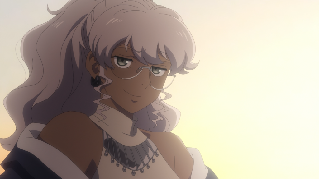
Examine it yourself; take your time.
Here are some things that stood out to me:
- Her glasses are a bit malformed
- If the character CVs on the official site are any indication on how character designer Toshihiro Kawamoto intends Naomi to be drawn, then the curve of her cheeks should be finer, and the shape of her face less square. However, the character sakkan all appear to have their own ideas about what shape her face is. This is because the character sakkan are based
- She has her shoulders shrugged forward: a movement which on no frame looks quite right and leaves her shoulder girdle a bit misshapen
- The shadows lack form and volume
- No sense of control to the line work
- No sense of volume in the hair (downstream of the linework and shadows)
All in all: a good drawing.
True, it’s not a solid drawing. Naomi’s smirk is weird enough, and this drawing makes it weirder. The genius of Kawamoto’s approach is that the worse you draw Naomi, the more like a dork she looks, and the stronger an impression the drawing leaves: truly a design for the modern era. This Naomi is good.
I’m taking such a close look at this drawing because it’s load-bearing. This isn’t the only good drawing from the first 25 seconds or so of the OP, but it is one of the only ones that successfully tell us something relevant about the main characters. The reaction I’ve read the most from other sakuga fans is that this OP feels like a bunch of shots from the show strung together, which gets at the truth. The culprit is the “stringing together.” The culprit is the montage.
“Montage?”

Montage!

It’s the word I use instead of “editing” for how images are put together in 2D animation. Most Romance and Slavic languages use a similar word to refer to film editing, but I use it in English because many decisions made during editing in live action cinema are made far upstream of the "editing" stage in anime. I want to make it clear that I’m talking about the images themselves, not the editing process.
Consider the sequence of shots, excerpted with audio:
What’s the montage doing?
Rouge is contemplating her hands and Naomi is in the Martian wastes. Both sequences establish something about their interiority: questions of identity for Rouge and perhaps hints at a façade for Naomi – but let’s set that aside for now. The shots of Rouge and Naomi walking through the city towards the center of the screen from opposite ends imply that they’re walking to meet up, but at no point in the OP do we see the meeting. We later see them together, but the montage does not anchor them in the same space – does not anchor their comradery. That’s fine. You might guess that the relationship between the two main characters of a buddy action cartoon would be something Takafumi Hino might consider the OP’s salient goal and not something to save for the penultimate cut, but perhaps I’m thinking too narrowly.
(I’m serious: emphasizing their separateness on Mars in contrast to their friendship on Black Hole Prairie Planet could turn out to be the right choice)
This is all a bit pedantic, but hold on, because if I want to give a convincing account of why the montage feels a bit aimless, I have to get even more pedantic. My real question is this: what’s the purpose of Rouge leaning against the Production Committee Pillar, and Naomi adjusting her glasses and looking at the viewer?
Do they add to the rhythm?

Nah; the montage cuts on the beat, but it doesn’t follow a rhythm. This isn't the Evangelion OP.
Well, what is?
Do they place Naomi and Rouge in spatial relation to each other?

Nope, Rouge is in a new location, and the shot of Naomi is close cropped so as not to place her in any relation at all.
Does the semiotic content of each shot recontextualize the surrounding ones?

Not meaningfully. If you're a new sakubuta and you're not sure what I mean, go read Lev Kuleshov's theory of montage in The Art of the Cinema – I promise it's useful for thinking about animation even though he'd be the first to admit that he was very much shaped by the extremely specific circumstances of live action cinema in the late 1910s. (He later walked back some of his claims in The Practice of Film Direction, but at the risk of alienating our Stalinist readers: lmao)

Do they contrast or compliment in composition?
   -or in color?
   -or line of motion with the shots surrounding them?

Not really. The color palette of [Rouge ≫ Naomi ≫ White Suit Fellow] goes [warm ≫ cold ≫ warm], but this is a 4/4 song and it’s not enough to establish an interesting pattern. Frankly, I doubt it’s even intentional.
The only way I can see in which any of these shots compliment each other is that Naomi and White Suit Fellow look up with the exact same seven drawings on 2s timing, albeit Naomi has somewhat more pronounced slow-in-fast-out spacing. It’s actually kinda nice.
-and there may be something to it. The shot of Naomi looking up is followed by the blonde haired fellow in the white suit looking up, which is followed by the robots looking up in prayer, which is followed by a robot pointing upwards. This is perhaps the strongest, most sensible piece of montage in the OP. The issue here is that Naomi is looking up at the viewer, rather than away towards the heavens. The shot of Naomi looking at the viewer is a sort of bridge to the “looking up” part, but it’s a bridge from nowhere, since Rouge and Naomi looking at the viewer are already out of place. Moreover, the “looking towards the heavens” motif starts before the bridge in the song begins, unnaturally splitting the images over the bridge, robbing the montage of a source of power.
The montage implies that what they’re all looking up towards is Rouge in her Gladiator form, which I’m not entirely sure how to understand since the imagery of the shot isn’t obviously religious nor obviously ironic, but that’s not the confusing part. What confuses me is that it’s followed with Naomi eating a slider, standing on a rock with some alien megastructure in the background. This would be a good image in isolation, but again, what’s it doing in this sequence? I don’t think it’s really deflating the previous shots with humor, or contextualizing its imagery, or establishing some rhythm. It’s just a cool image Fumi Hinotaka, Motonobu Hori, or perhaps one of the designers came up with – but which has been inserted more or less at random.
This is not the only cool image; I do not intend to spend my first non-news post on artistunknown slamming the Metallic Rouge OP. Here, look at these circles:
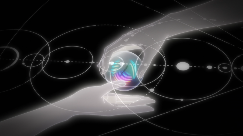
Aren’t they neat? This isn’t real stellar cartography (nor is it likely anything to do with particle physics – the thought occurred to me too), but you get the idea. Understandably, a lot of the best parts of this OP are the parts which show off the designs. The backgrounds and colors are mostly too boring for this to be a truly great showcase, but the fake orbital trajectories? The Gladiator with a bunch of arms? That weird spherical data storage device that looks like a decorative orb you’d buy on Etsy? Good shit. Nor is this the only good part of the OP. Let’s take another look at this cut of Rouge walking.
The animator sells Rouge’s walk with an exaggerated lean on each stride, her hair wildly swinging as secondary action. They push the extremes of her sway on the left stride as she moves her arm – adjusting her coat. Note how the folds shift with the movement. Truth be told, I’m not entirely sure the folds are supposed to be rippling like that or if this is douga melt – Naomi’s walk cycle does not fill me with tremendous confidence in the draftsmanship of the team – but why let a bit of melt get in the way of a good cut? The little arm shift is nice. There’s a charm here. Appeal! Charisma! SOVL! Are these words synonyms? I honestly can’t tell anymore. In any case, this walk is good – a good cut!
It matches, in a sense, the much later and unambiguously well-drafted cut of Rouge and Naomi being good pals on a windy prairie orbiting a black hole.
This isn’t an all-time great depiction of mass and inertia, but it’s decent. Naomi and Rouge’s movements are mostly anticipated by shifts in their posture which throw their center of gravity either forward or backwards. The only shift which doesn’t follow this is Naomi’s final lunge, which is rather sudden and not accompanied with a change in her footing. The only downside is that Rouge’s coat, which so excellently framed her legs with a dark maroon background in the previous shot, now blocks us from seeing her own footing, which could’ve really sold the transfer of energy from Naomi to Rouge as she falls into her.
However, I still have not answered why anyone would want to write about the Metallic Rouge OP. I’ve highlighted some elements which I think are nice and wish to commend, but they aren’t so transcendently good that I’d ordinarily write a whole piece about them. A few tweets would’ve been fine. In fact, I diagnose this OP with chronic mid. This is a disease which is endemic by definition, and while I’m honestly surprised that this team wasn’t able to achieve better, it’s certainly not my intention to take them to task for mid crimes. Nor, however, is it my intention to elevate the mediocre work of the humble artist_unknown who labors in obscurity out of a Romantic sensibilité which I would feign dress up as a political program. So like,
>why?
It’s because I must confess: I don’t know how to write about sakuga. That much is clear, but thine work and mine is vitiated by the same problem: it almost doesn’t matter what you say about good or bad animation because the audience will almost always be on your side. If you can’t really describe why Mitsuo Iso’s animation works, that’s okay, because just look at it: obviously it’s good. Attempting to understand and describe what makes something mid, however, affords nothing and reveals all.
In my evaluation, my efforts here are much like the Metallic Rouge OP:
mid.
…but hey, the song is nice!
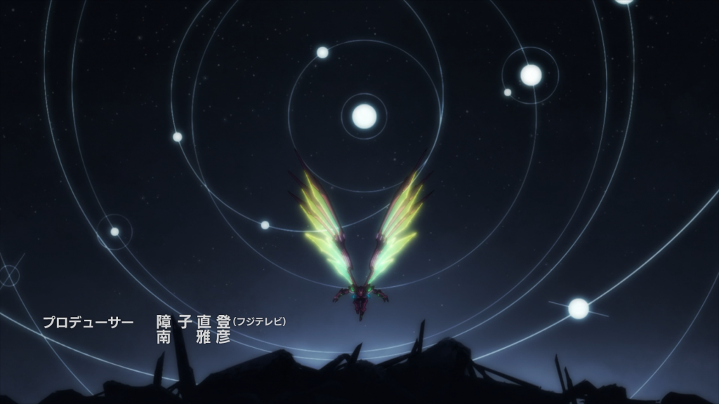
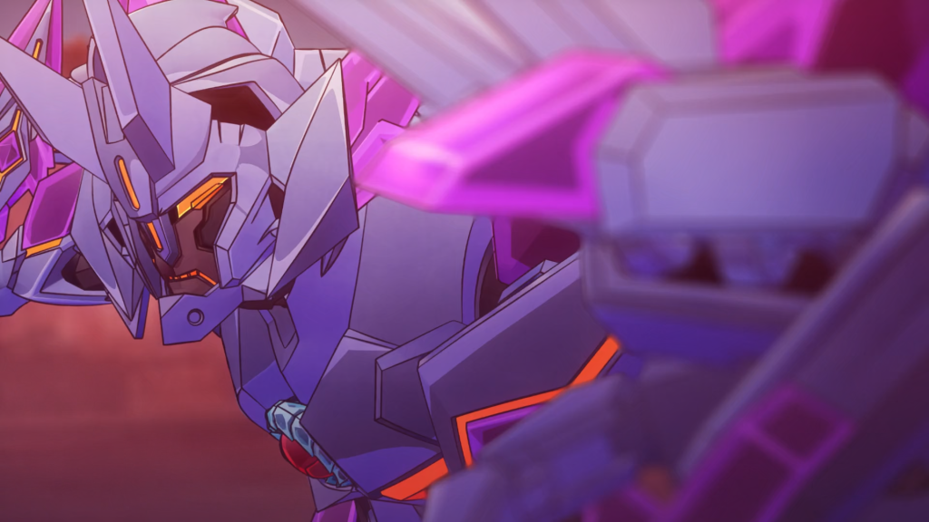
Yuuki Bakuhatsu Bang Bravern
by kbnet
Bang Bravern makes an appeal to almost every single possible type of robot anime fan all at once, and so far, it is wildly successful on all counts. “Jack of all trades; master of none?” Nonsense! Its opening, directed and boarded by Masami Oobari himself, is the pitch in miniature.
Does it make a good pitch to the robot otaku?
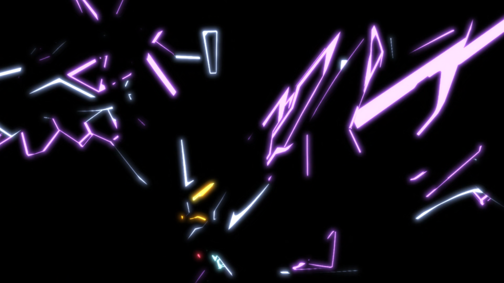
Hell yeah man! Look at these poses!
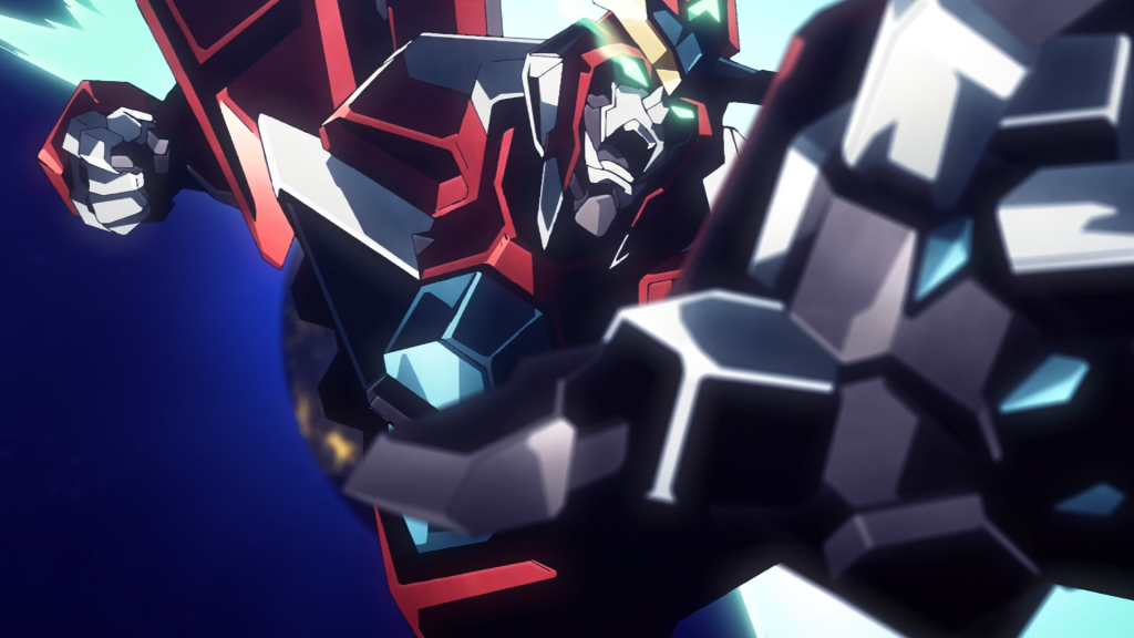
Some of them are 3DCG, some of them are hand drawn, all of them are cool. Oobari is a big fan of hybrid productions like these – or so he says on twitter to his 3DCG director. “3DCG + hand drawn = the best and the strongest! 🔥🦾”
If I were directing a robot cartoon in 2024, I’d find it pretty hard to disagree. Bravern’s OP makes a good case for the hybrid approach despite the 3DCG’s obvious shortcomings. It’s generally the shading and texture which let it down rather than the animation itself – and these are shortcomings which apply almost as much to the traditional parts. I think a truly serious look at mechanical animation in the modern industry is overdue, but that’ll have to wait.
I’m inclined to agree with Bursty’s guess on the booru that Akira Amemiya is likely the artist_unknown behind the left image, based on a process of elimination and on how the knuckles in the explosion’s gas cloud are shaded, but I wouldn’t give us better than 2:3 odds. Maybe someone will tweet it out eventually. I look forward to completely eating shit as usual.
There’s more; let’s continue.
Let’s consider this brief 3DCG cut of Superbia.
First of all, thank you artist_unknown for the neon impact frame. I honestly don’t know if it’s a hand drawn frame or part of the model, but it’s cool. It emphasizes where Superbia snaps back a few meters, maintaining the pose-to-pose feel of the animation. Oobari will sometimes use impact frames to emphasize dramatic spacing in his own animation, which a good 3D animator who took a moment to browse the booru could hardly have failed to notice whether or not Oobari personally involved himself in the process. The result is fairly effective.
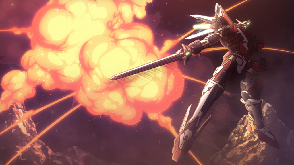
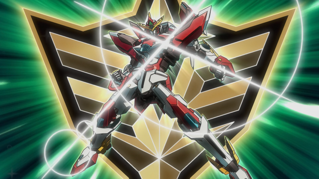
None of this would work without decent effects animation. Look at those nice horns of debris. This is a classic robot explosion with deep red shadows shading around the edges of the gas cloud. There are more modern and, in my opinion, better ways of drawing an explosion, but this is one of the classics – and a great fit for Bravern. The funniest part of this cut however is that Bravern is already doing a Super Robot Wars pose. Listen, Oobari, we all know it’s gonna happen, but don’t get too cocky.
How about to the military otaku?
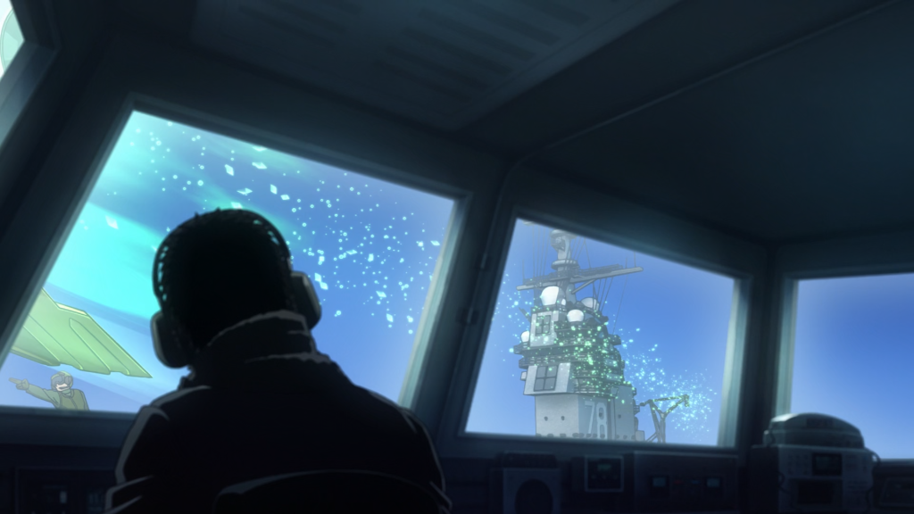
The opening shots are of Bravern in Bravethunder mode riding USS Gerald R. Ford’s (…nonexistent) centerline elevator! We get a nice view from the fore catapult control station of Bravern conducting an unassisted takeoff with Lightning-Cs and Titanostriders lined up along the deck! A Burke engages something with its deck gun timed to the「燃やせ!燃やせ!燃やせっ!」and match-cuts to a shot of a Titanostrider! And you see these two girls?
The bridge bunnies in this cartoon control the battle from JSTARS! Do you understand that no other anime to my knowledge has JSTARS despite it obviously being the correct platform to observe and control a multi-domain combined arms robot fight? Sure, they were just recently retired, but fuck it, it’s the superior cinematic choice to having the bridge bunnies sit in a hutch somewhere, and this is reparation for decades of anime directors not understanding what an AWACS does. It even looks like they re-engined it with modern high-bypass turbofans, hinting at an in-universe explanation. Kino!
Incidentally, did you know this is a blog about sakuga?
Anime boy likers?
This is inarguably one of the most relevant demographics of robot cartoon fans – and especially this particular robot cartoon. There’s admittedly not as much here, but no worries: there’s a whole ED for that. I can’t really appreciate anime boys the same as some people, but look at this drawing! Folds and shadows that make sense! Foreshortening! Nice anatomy! Dynamic pose! SPACE! It kicks ass! Honestly better than any drawing of any girl in this OP.
But speaking of which,
Bishoujo connoisseurs?
This is the weakest appeal the OP makes, but it does make it, and I need an excuse to talk about the character designs in general. Oobari boarded some rather pedestrian character introduction stuff here, but he did so competently. In the process, we get to see Kamo Kamen’s slate of mildly disappointing character designs.
I’m a big Hibike! Euphonium fan, so of course I was well familiar with Jae-uk Noh’s wonderful fanart, and by extension his designs for his (still) unnamed OC couple K and M. Was I confused when he was announced as the character designer for this cartoon? A bit, yes! I wasn’t blown away by the promotional reference sheets, which seemed to lack his usual taste in fashion – color blocking and hair in particular. The strong points here are his expressions, which are perhaps the part which shine through the brightest both in the OP and in the anime itself.
Is this a good drawing?
Eh.
However, it is undeniably a good idea for a drawing. You do immediately understand that this is an enthusiastic yet dweeby maintainer: an extremely accurate impression both of her character and what maintainers are like in real life. To the extent that Sergeant Miyu Katou is a good character, this OP introduces her well.
The credit for turning Kamo Kamen’s concepts into usable expression sheets goes to chief animation director Kouichi Motomura. This is a man who once said he aims to be a versatile animator in the tradition of Toshiyuki Inoue, but who also readily admits he just loves to draw bishoujo. While we can’t see his sheets, we can see his sense for expressions on display in his CAD corrections. I quite like the one of Bob the spook. Versatility indeed.
Taken together:
Bravern’s OP is great – and I haven’t even mentioned the song itself! I can’t wait until there’s a real release so I can replace my low bitrate youtube rip for running. Listened to it near the end of an 8k just the other day. S+. Watch Bravern.
Some honorable mentions that feature great OPs but didn’t have quite enough (for one reason or another) to embellish on: Dungeon Meshi, Solo Leveling, Undead Unluck, A Sign of Affection, and more!
If you enjoyed this post, please consider supporting on ko-fi: here
I probably need to re-read that Metallic Rouge section a few more times because it threw me for a loop lol
Appreciate the write-ups!